In Eventbuizz, we offer a dedicated section called “website design” for managing event side website and its theme. Each design theme comes with a customizable theme to give your event website a unique look and feel. Currently, we offer one theme called the “Eventbuizz Modern Theme.”
Theme Details
- Theme Name: Eventbuizz Modern Theme
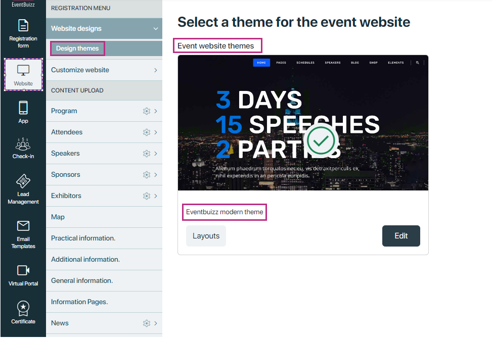
Eventbuizz Modern Theme Features
The Eventbuizz Modern Theme is designed to provide a contemporary and user-friendly interface for your event website. It comes with various layouts tailored to meet different event requirements.
Layouts Available
-
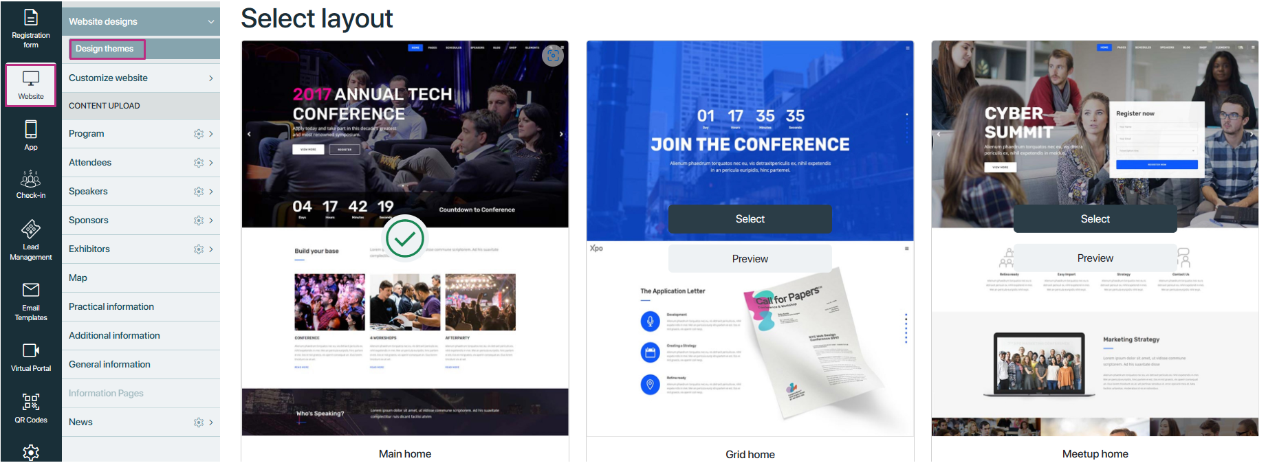
Main home
-
Grid home
-
Meetup home
-
Coaching home
-
Symposium home
-
Convention home
-
Conference home
Future Enhancements
While we currently offer the Eventbuizz Modern Theme with these layouts, we are continuously working to expand our theme library. In the future, we plan to introduce additional themes and layouts to provide event organisers with even more options to customise their event websites according to their preferences and branding.
Here a look how layouts will shown to user in “Eventbuizz modern theme”
By default First layout “Main home” will be selected and event side look like this:
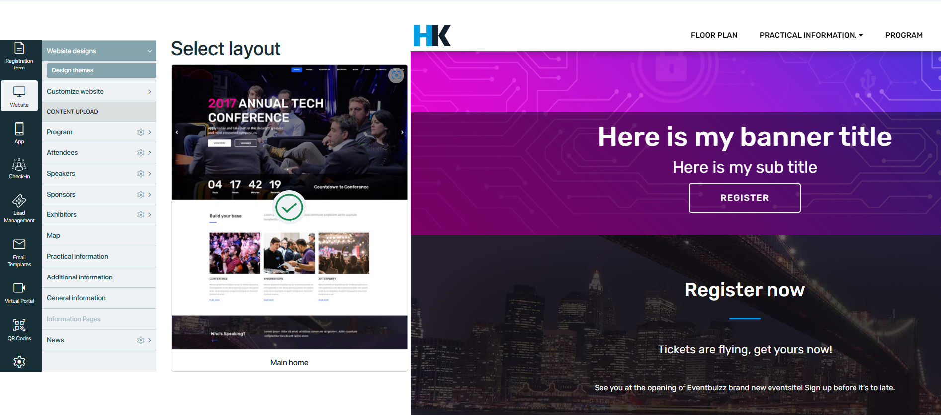
And on Each layout user have two options:
- Select Layout: Choose this layout for your event side.
- Preview: Preview this layout to see how it looks before selection.
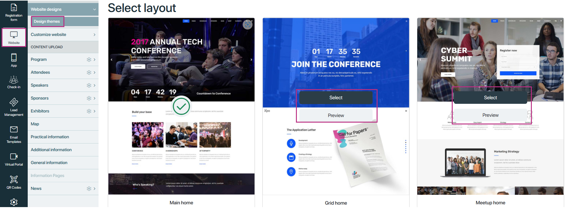
After selecting a layout for your event website, you will be redirected to a screen where you can customize various sections to tailor the website to your needs. Each section has different variations, allowing you to choose the one that best suits your event’s style and objectives. Here are the sections available for customisation:
Navigation Bar
- Allows users to navigate through different pages of the website easily.
- Variations include different menu styles, such as drop down menus, hamburger menus, or tabbed navigation.
Navigation bar have two sections:
-
Selected variation
-
All Versions
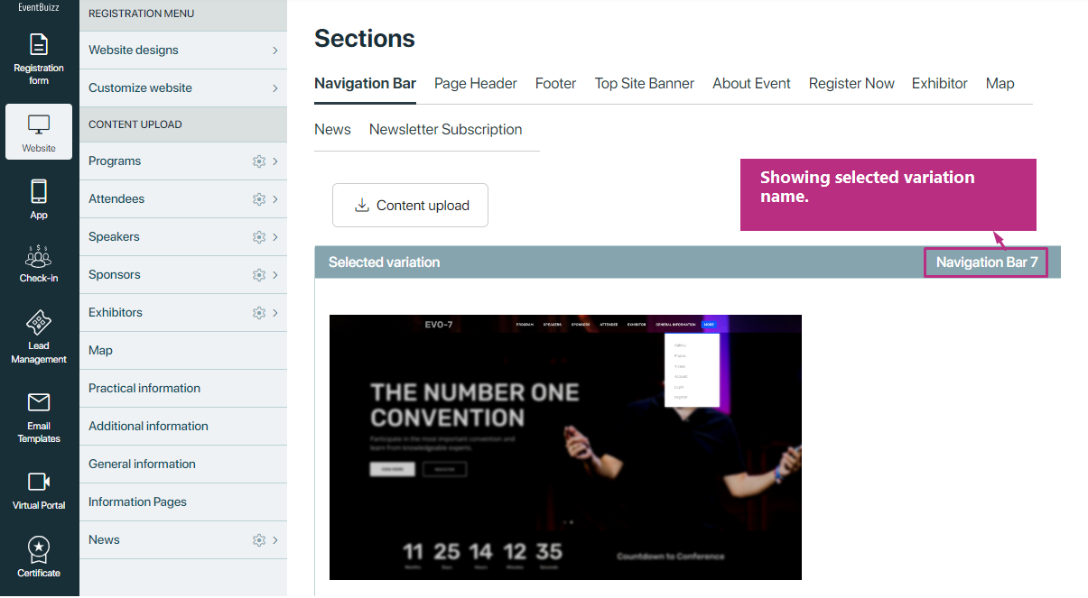
Selected variation
Selected variation section box show the selected variations style with name, it looks like this.
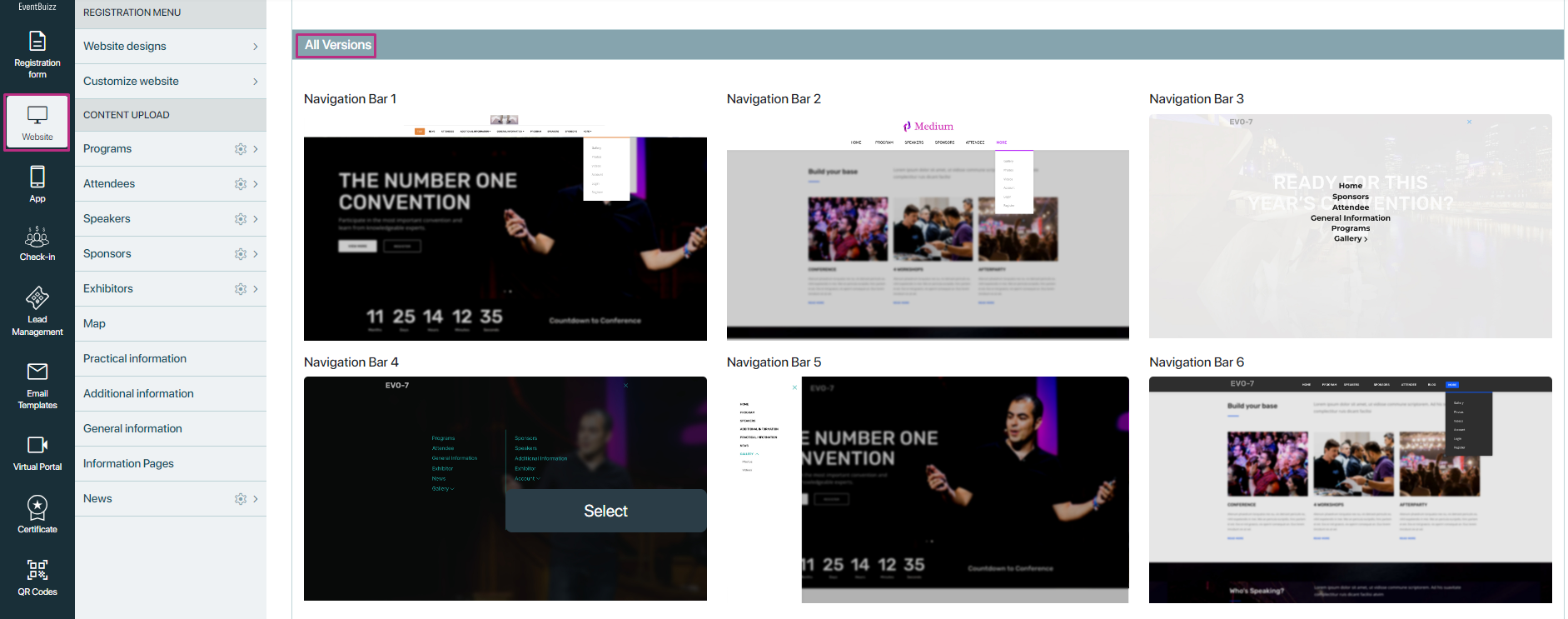
All versions
All versions shows all available variation for navigation bar, it seems like that:
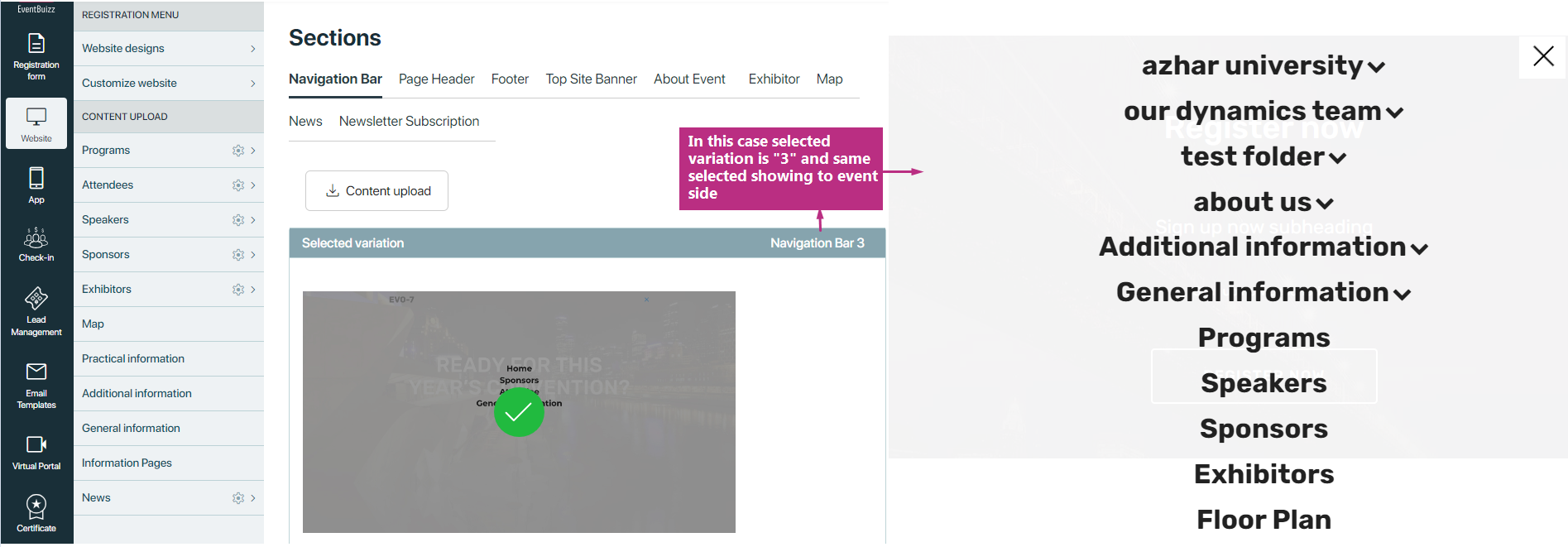
How it works
By selecting any variation from the all version list it will be selected and moved from all version to selected version box and in event side it will change as per selected version
Page Header
- Provides a visually appealing header section at the top of each page.
- Variations may include different header layouts, background images, or slideshow banners.
Page header have two sections:
-
All version
-
selected variation
All version
In page header we have total three variations and this section will look like this:
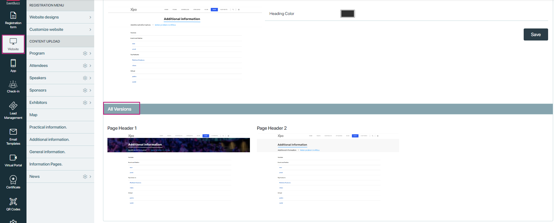
Selected variation
In selected variation box user have two different scenarios
- if user selected a variation in which background image is also existing, then user can upload background image and also can change heading colour as well.
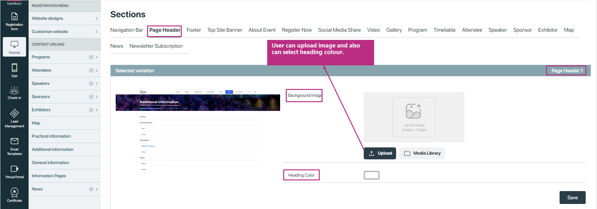
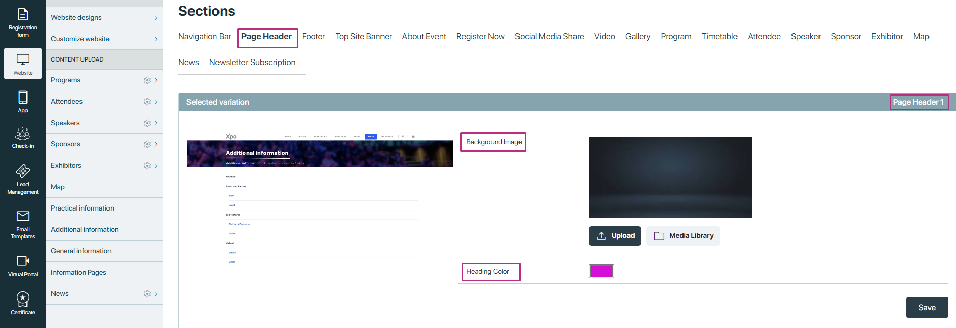
Let suppose user add a background image and also select a heading colour, here is the screenshot:
In event side it will look like this:

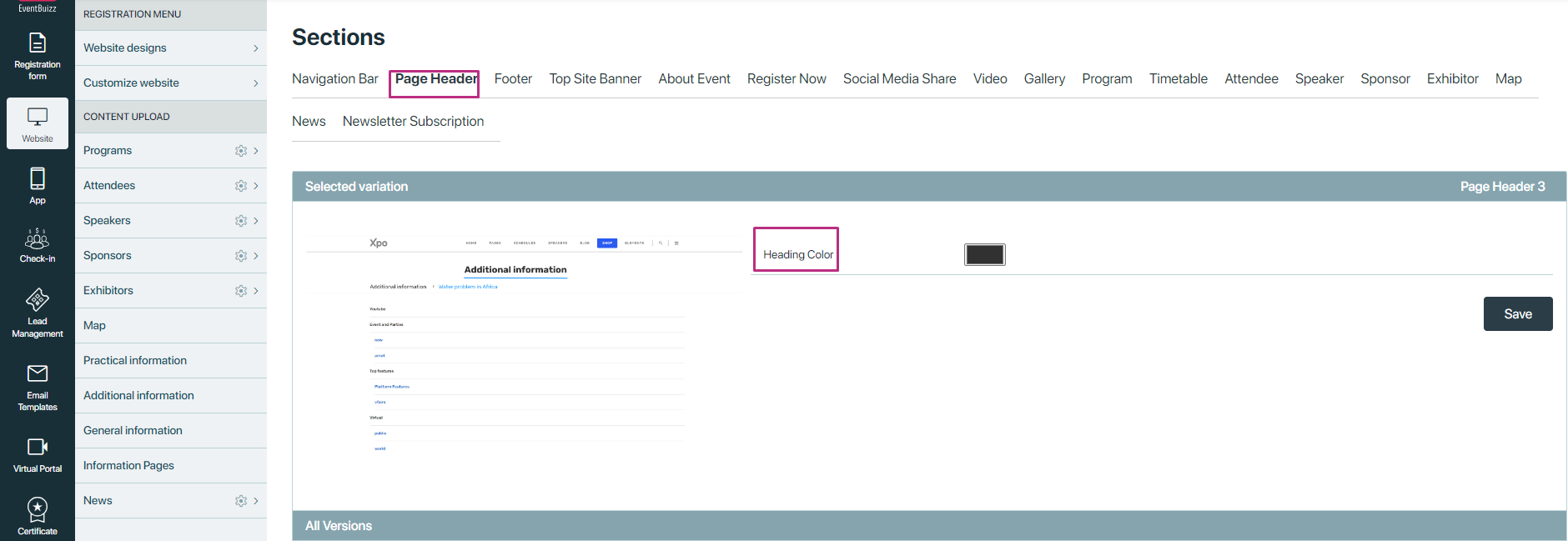
If user selected variation without background image then only he can change heading colour, see attached screenshot:
Footer
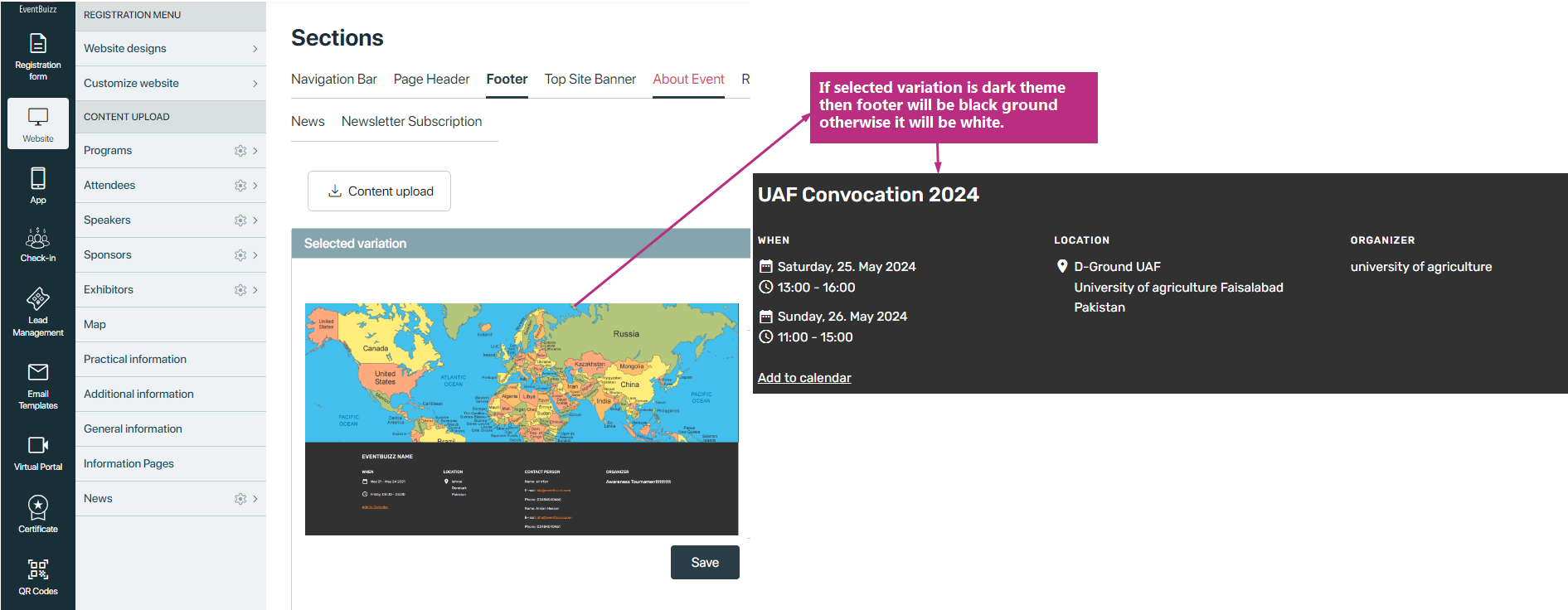
- Appears at the bottom of each page and typically contains columns of contact person, location, Event hours etc.
Footer have two variations:
- Dark background
- light background
If dark background theme variations is selected then in event side footer colour will be black otherwise shows in white colour
Top Site Banner
- A prominent banner section at the top of the homepage, often used for announcements, promotions, or featured content.
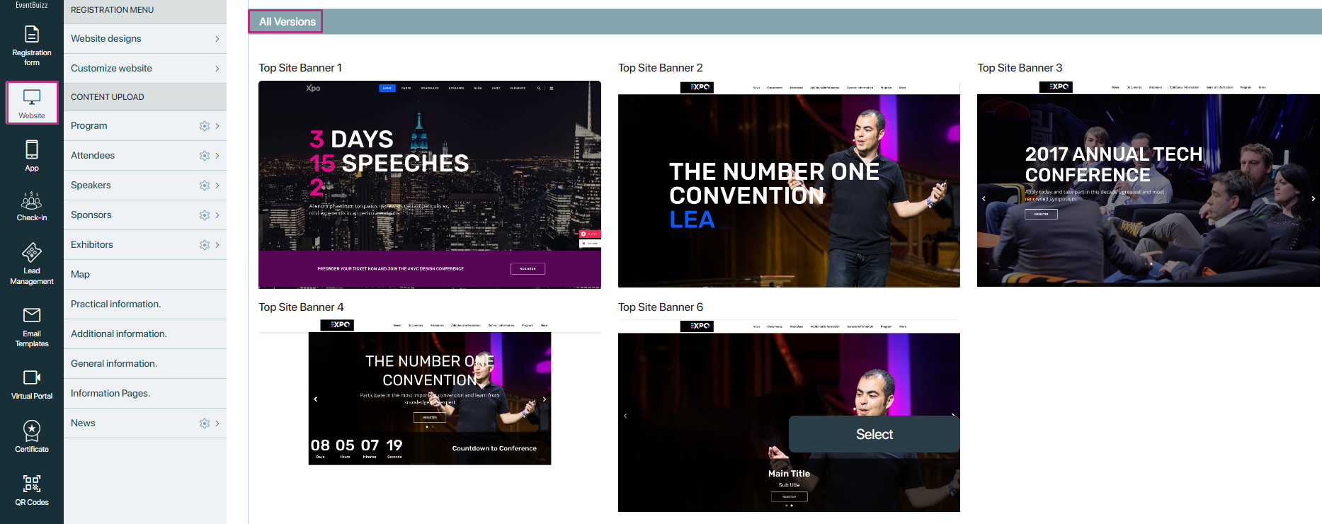
- Variations may include different banner styles, text alignments, or call-to-action buttons. And have different recommended size for the top site banner section we have
Recommendation:
Top Site Banner 1 + 2 + 3: 1920px width, 1100px height
Top Site Banner 4: 1300px width, 680px height
Top Site Banner 5 + 6: 1920px width, 820px height
In Top site banner user have two sections
-
All versions
-
Selected variation
All versions
All version shows all the possible variations for the top site banner, here is the view of the all version sections:
Selected variation
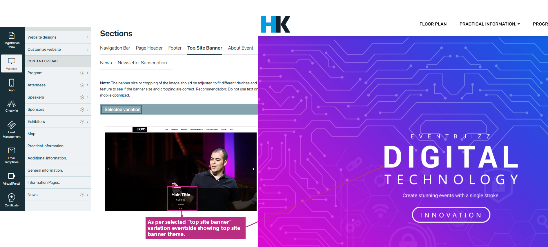
Selected variation box shows the current selected variations or theme for the top site banner section, and on the base of the selected variation event side top banner will look like.
About Event
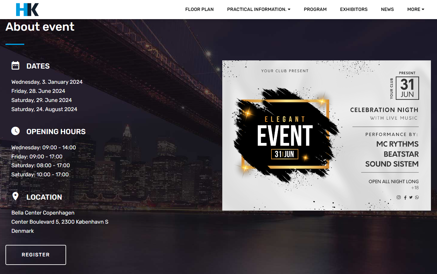
- Displays event details including booked dates, opening hours, and venue location.
- Provides essential information for attendees regarding event timing and location.
- Customizable with booked dates, opening hours, venue details, and additional event information.
In event side it is look like this:
About event can be Customise with two variations:
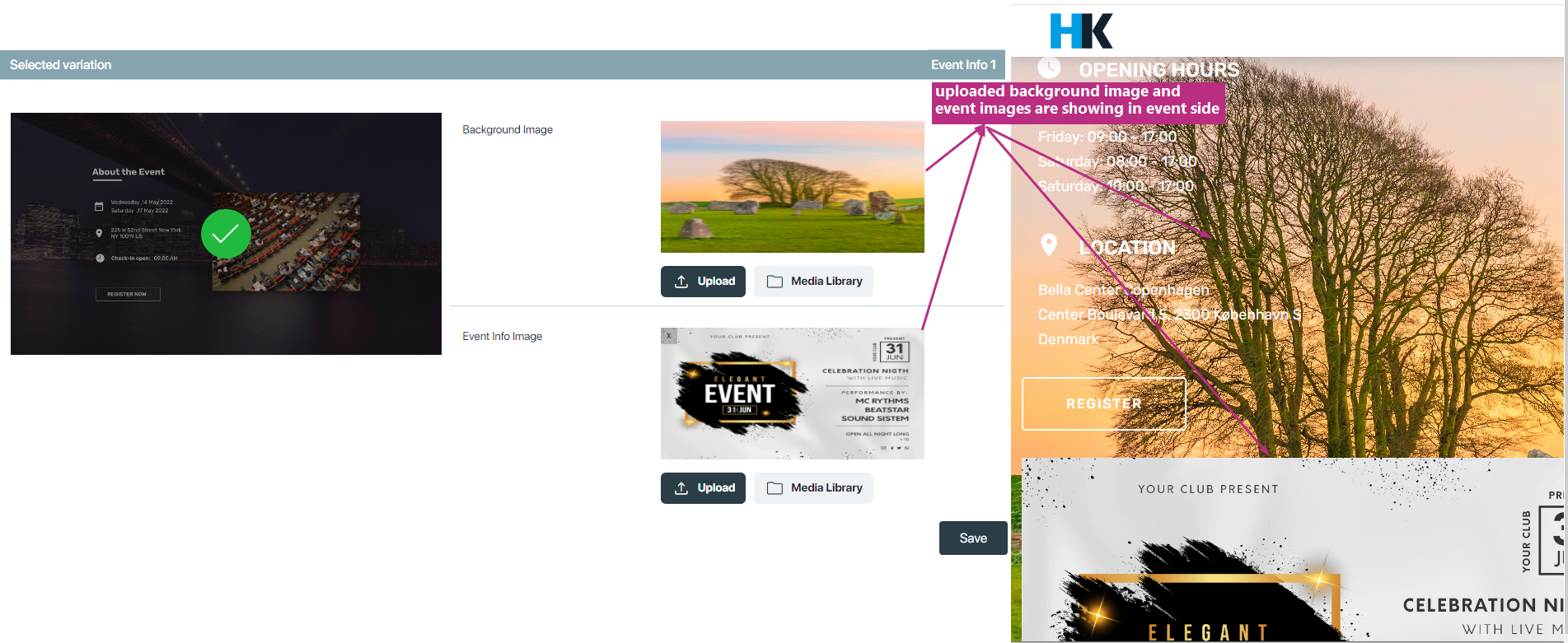
- Variation one called Event Info 1
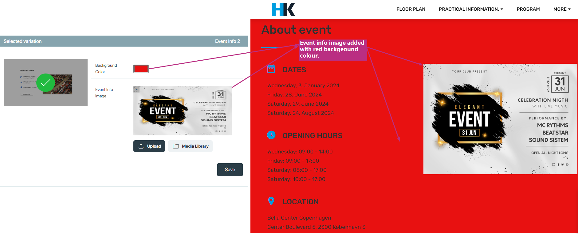
- Variation two called Event Info 2
Event Info 1
Allows adding a background image with accompanying event information.
Event Info 2
Only allows uploading an event info image with selection of background colour, user can set background colour of this particular section as per event requirements:
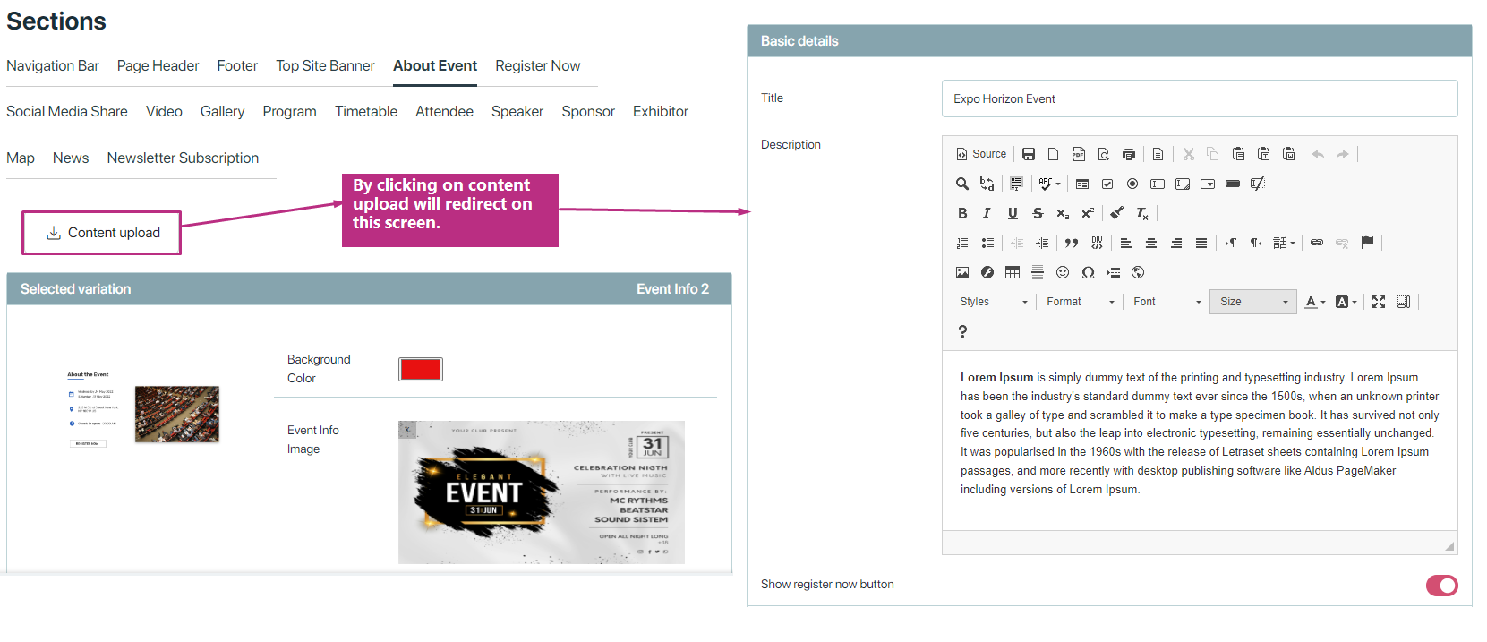
Additionally, on about event info section includes a button for uploading content, Clicking the button redirects to a new screen for adding:
- Title
- Description
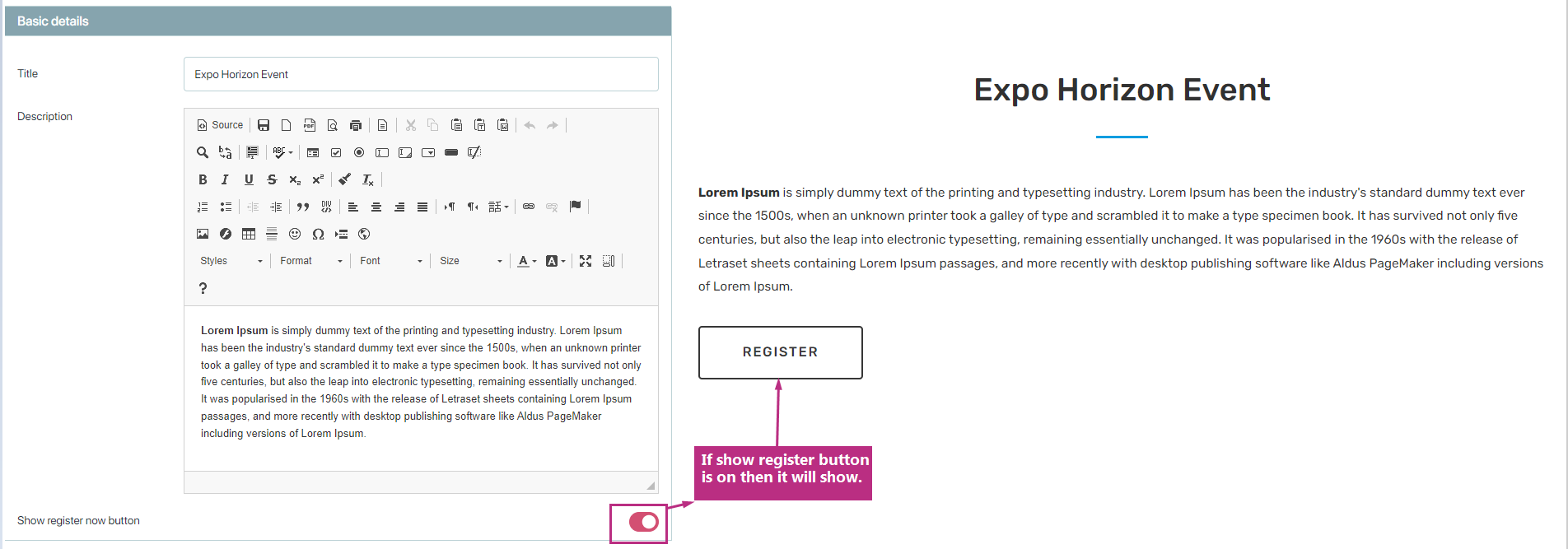
- Option to show/hide register button
Provides customization options for presenting detailed event information.
here it look like this:
In event side it look like this:
Register Now
This section enables users to register for the event, in event side a register now section show where user can click on register button and it will redirects to the registration form, where users can register them selves for the event. As like other section we have two kind of variations:
- Variation with background image.
- variation without background image, user have the option to select background section colour of his own choice.
Variation with background image
Allows user to upload image on background of this section, in currently available variations, 2nd variation have the background image upload option.
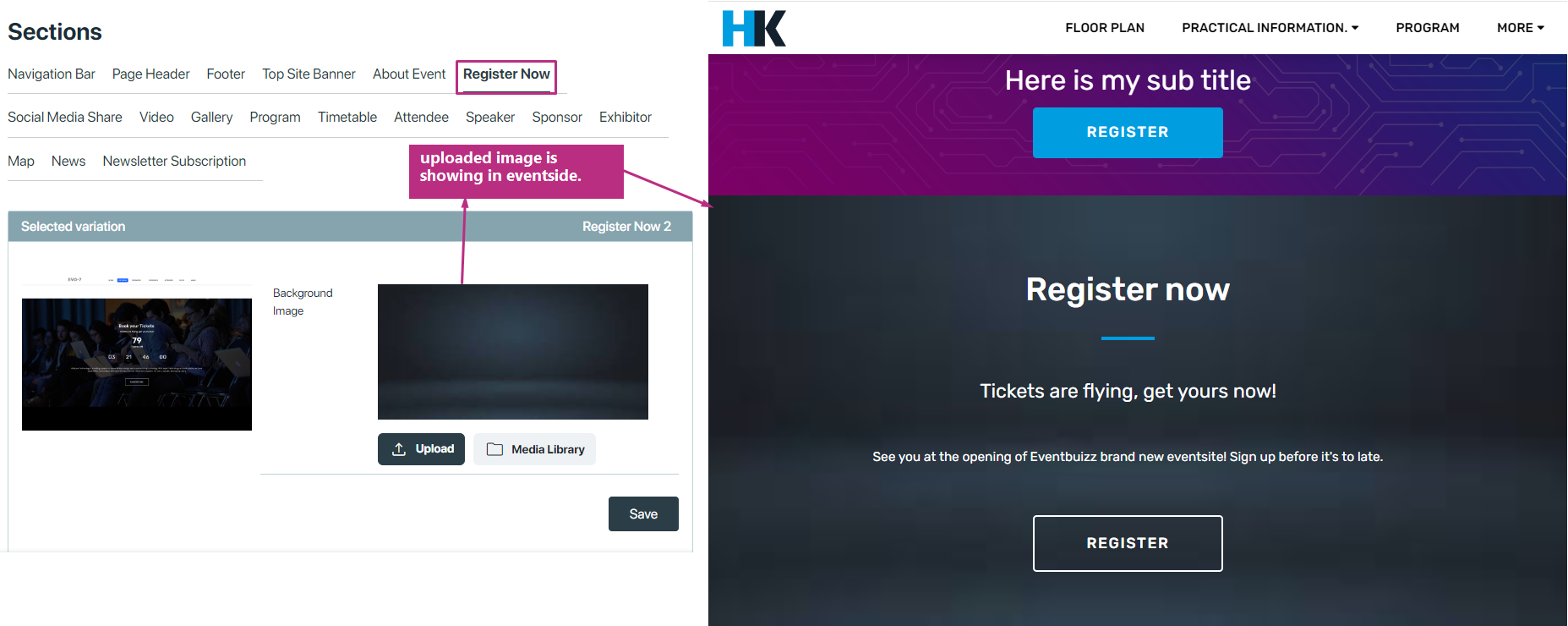
variation without background image, user have the option to select background section colour of his own choice. Except register now 2 variation all don’t have upload image background option just only user can select background colour.

Social Media Share
This section includes icons or links for users to access the event on social media platforms. As like others section user have two kind of variations to show the social media share section on event side:
- show icons with selected background colour
- show icons with uploaded background image
show icons with selected background colour
In this sort of variations user have the option, to show social media icons with background colour, almost all variations are same like this except social media share 3, in that user have the option to upload image.

show icons with uploaded background image
In this variation user have the option to upload background image to show the icons.
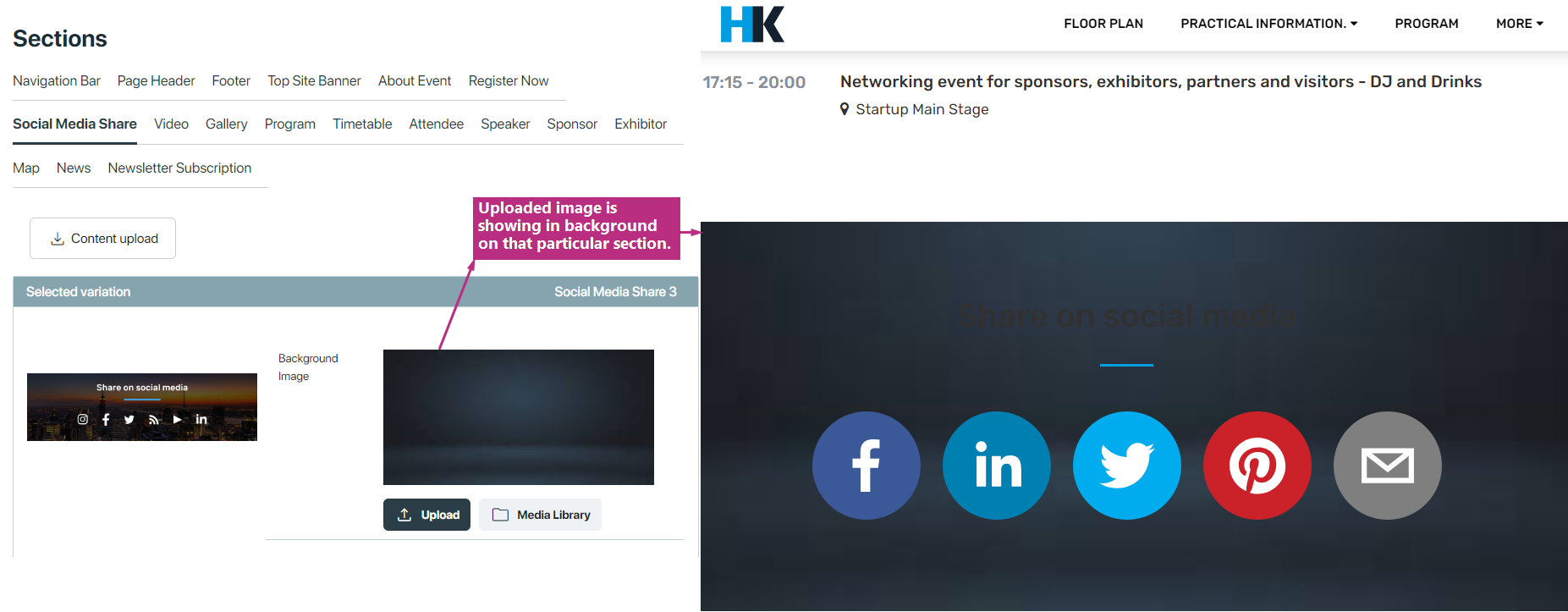
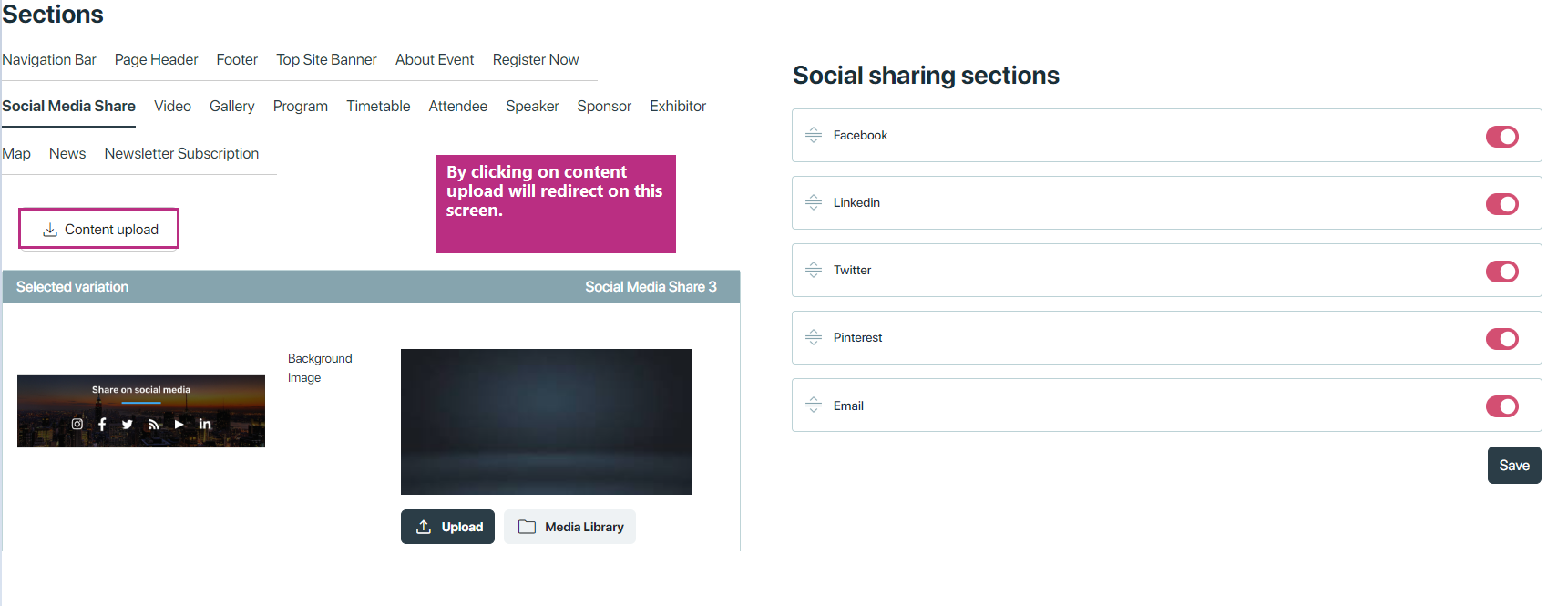
Additionally, in this section includes a button for uploading content, Clicking the button redirects to a new screen where user can set the orders which social icons user want to show first or last, also if user don’t want to show any social icon he can disable that one.
Video
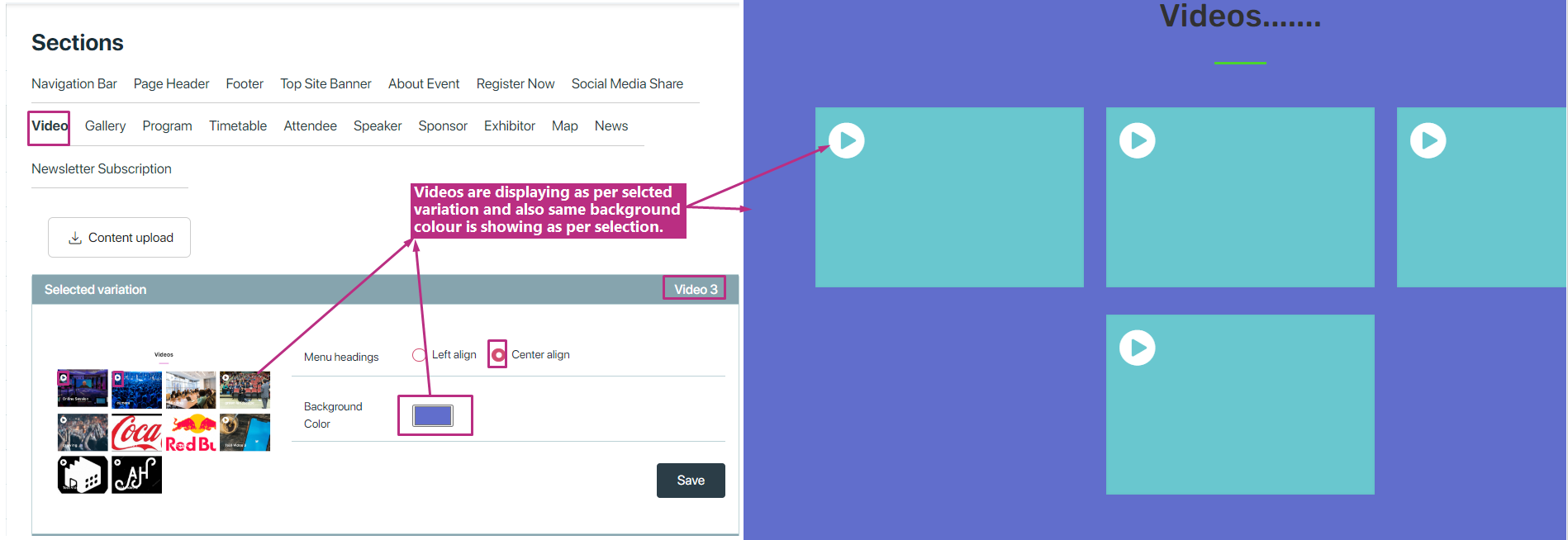
This section can feature promotional videos, highlights from past events, speaker interviews, or any other multimedia content related to the event. The Video section offers users eight unique variations for showcasing multimedia content related to the event. Each variation provides a distinct layout and design, allowing users to customize the presentation of videos according to their preferences.
Common Features Across Variations:
-
Alignment Options: Users can choose between left alignment or center alignment for the layout of the Video section. This flexibility allows users to optimize the visual presentation of videos based on their design preferences.
-
Background Color Customization: By default, the background color of the Video section is set to white. However, users have the ability to change the background color to better suit the overall aesthetic of their event site.
Gallery
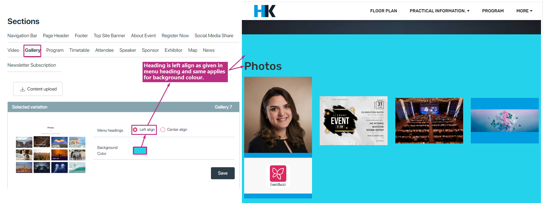
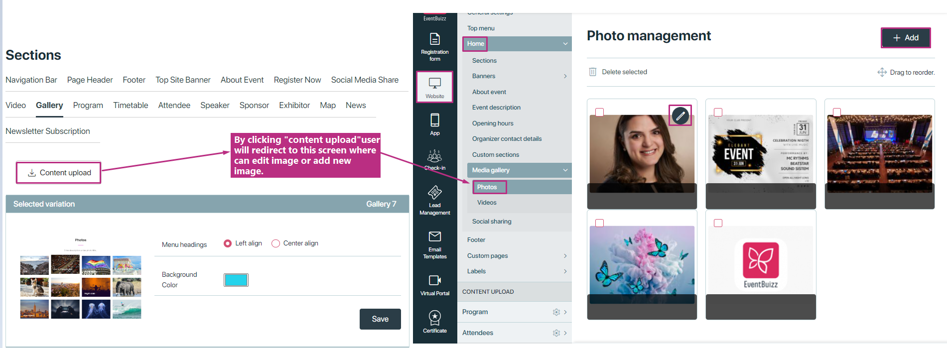
additionally, this section includes a button for uploading content, by clicking the button redirects to a image gallery photo management screen, where user can edit image title, change image or create thumbnail etc. Also user can add more images as well.
Program
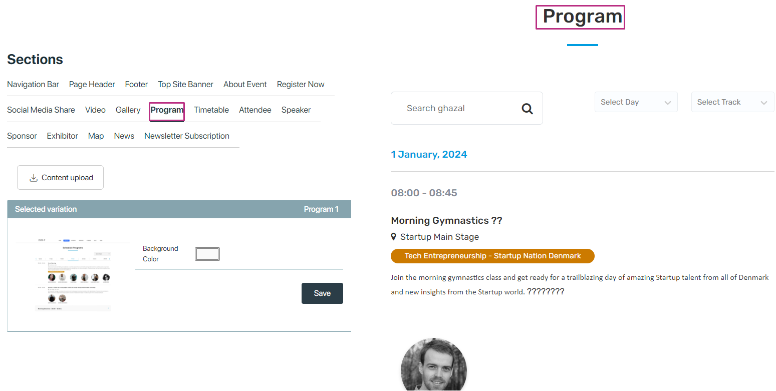
This section provide a visual display how program section will look like in event side, right now have only one variation to display programs but in future it can be enhanced, by default this variation have white background colour but user can change it as per event requirement.
Timetable
- Visualizes the scheduled program timeline, allowing attendees to plan their participation accordingly.
- Provides a structured overview of event activities, including session timings and details.
- Customizable with two distinct variations:
- Timetable 1
- Timetable 2
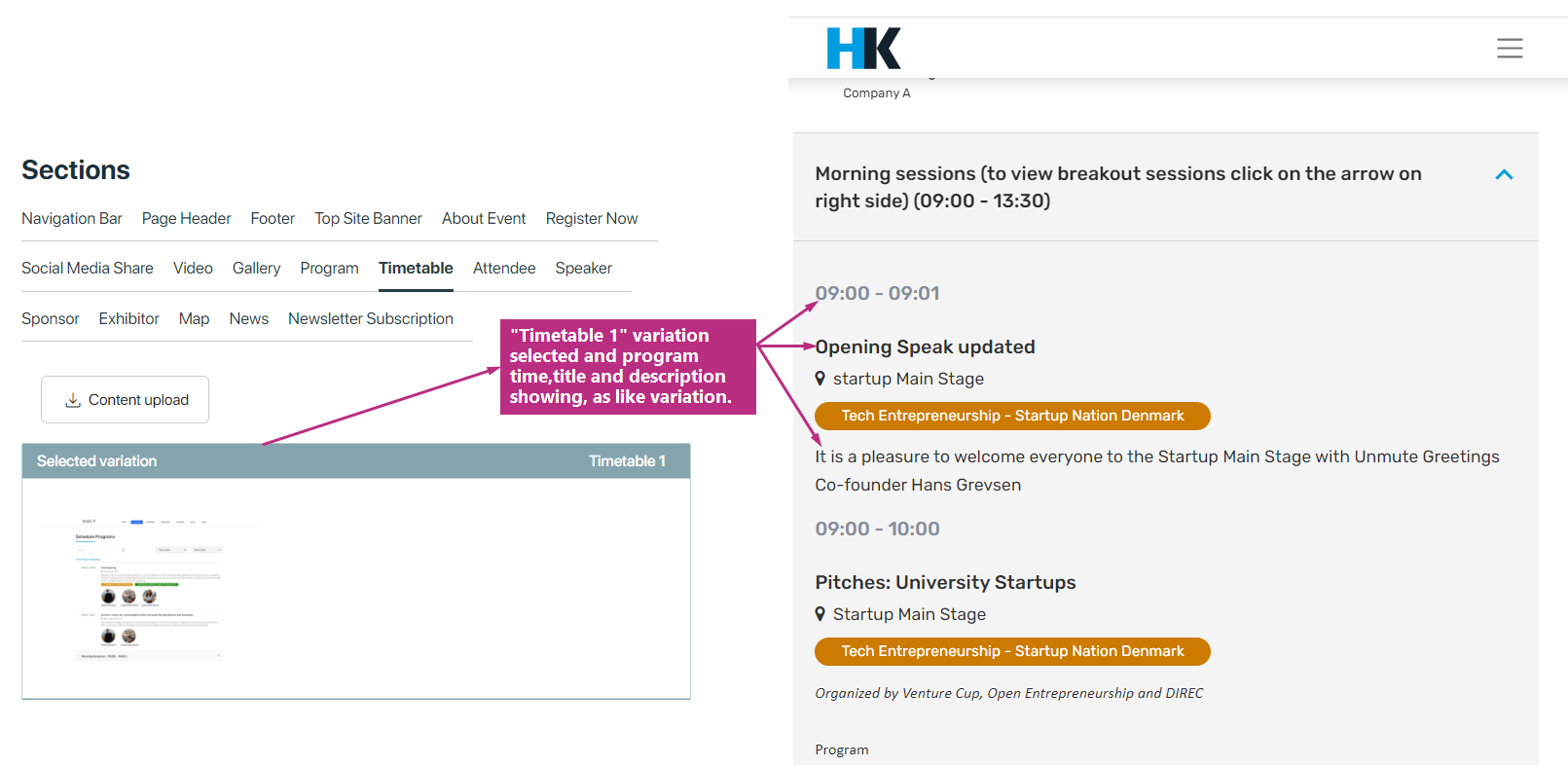
Timetable 1
- Sequentially displays program details, beginning with the scheduled time, followed by the program name and description.
- Offers a straightforward presentation style, facilitating easy comprehension of the event schedule.
Timetable 2
- Utilizes a calendar kanban scheme, resembling a visual calendar board.
- Programs are represented as cards or blocks, allowing for intuitive navigation and organization.
- Enables attendees to view program details by interacting with the visual layout, enhancing user engagement and experience.
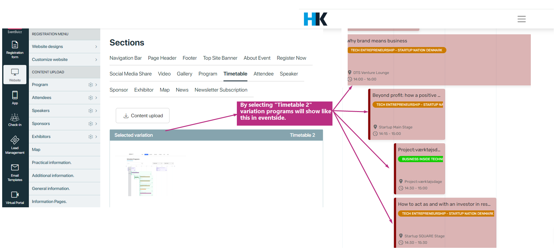
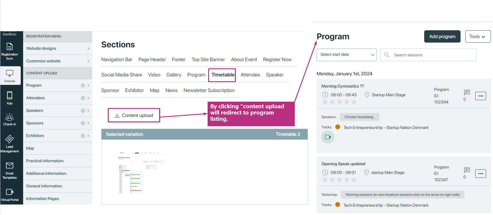
Additionally, this section includes a button for uploading content, same like program module and by clicking the button redirects to a program listing screen. see attached screenshot for detail:
Attendee
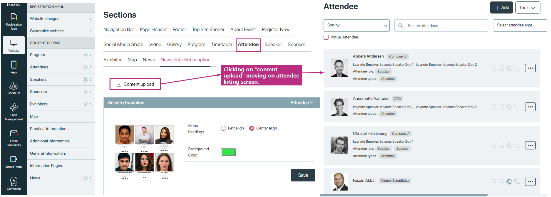
- Attendee section provides different kind of variations to displays all attendees assigned to that event, in event side, providing a comprehensive list for attendees to connect with one another.
- It also facilitates networking and interaction among event participants.
In attendee section user have two kind of variations:
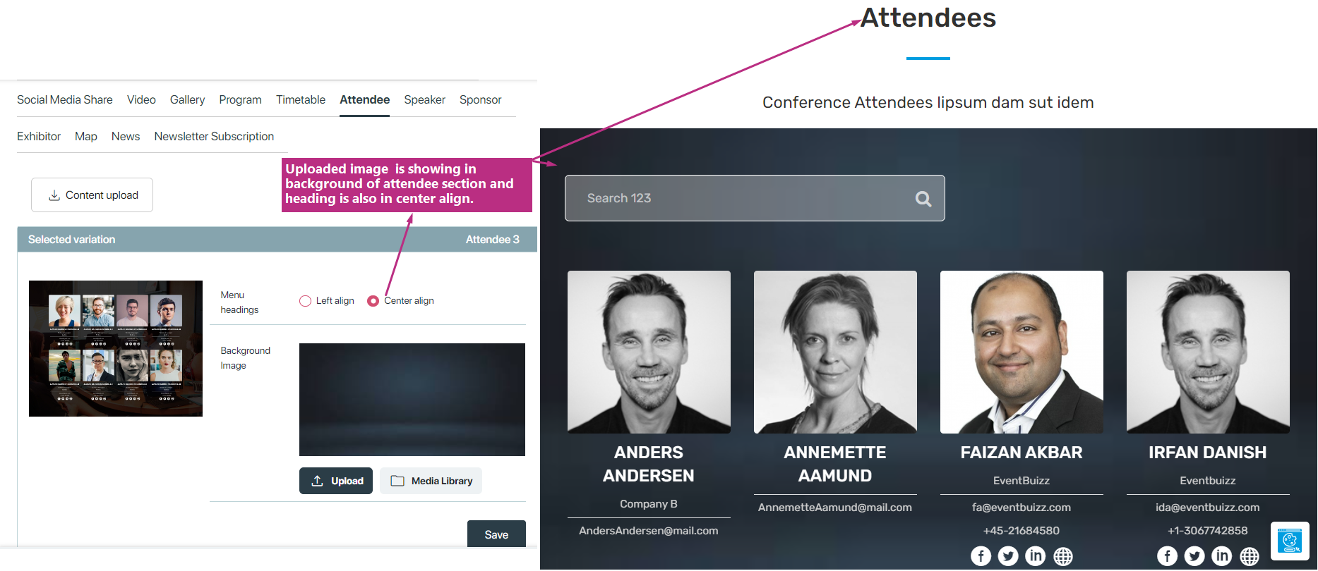
- Attendees variations with background image
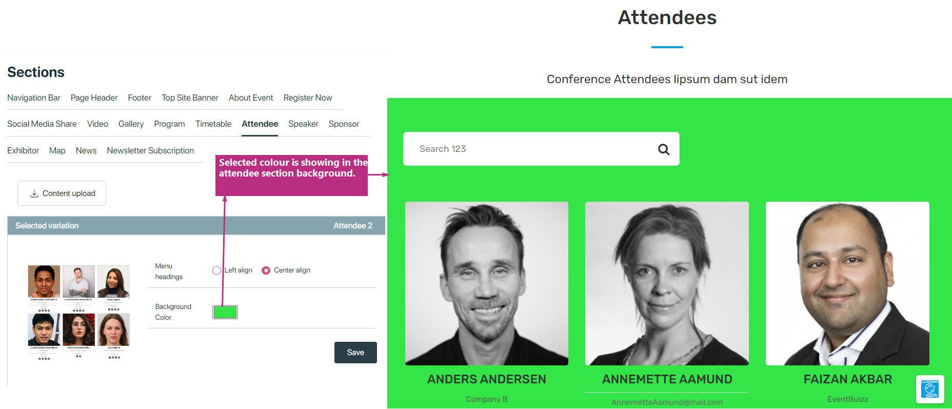
- Attendees variations without background image
Attendees variations with background image
-
- Allows users to upload a background image, enhancing visual appeal and customization options.
- Provides flexibility to align menu headings either to the left or center, enabling users to adjust the layout based on their preferences.
Attendees variations without background image
- In this group of variations it restricts background customization to changing the background color only, ensuring consistency in the visual theme.
- Offers menu heading alignment options similar to Variation 1, allowing users to choose between left or center alignment.
Additionally, content upload button will move to the user on attendee listing screen.
Speakers
- This section displays all speakers associated with the programs in the event, providing attendees with information about the event’s presenters.
- Enhances engagement and interest by showcasing the expertise and profiles of the speakers.
For presenting speaker, have two types of variations:
- speakers variations without background image
- speakers variations with background image
speakers variations without background image
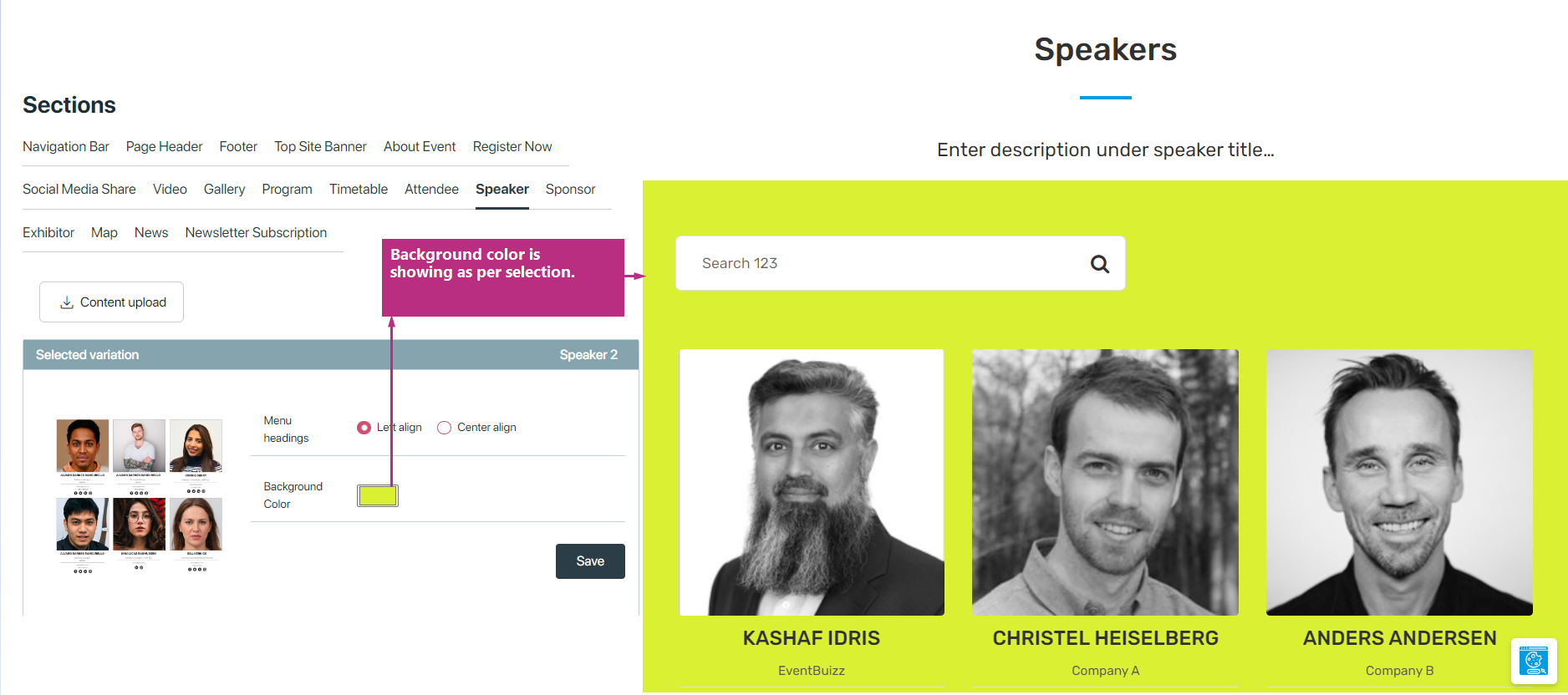
- In this type of variations user can display speakers with solid background, by default section colour will be white but user can change as per requirements
- Offers menu heading alignment options, allowing users to choose between left or center alignment.
- Also user can select any sort of variation which suits his requirements, like he can show speakers images in circle without circle etc.
speakers variations with background image
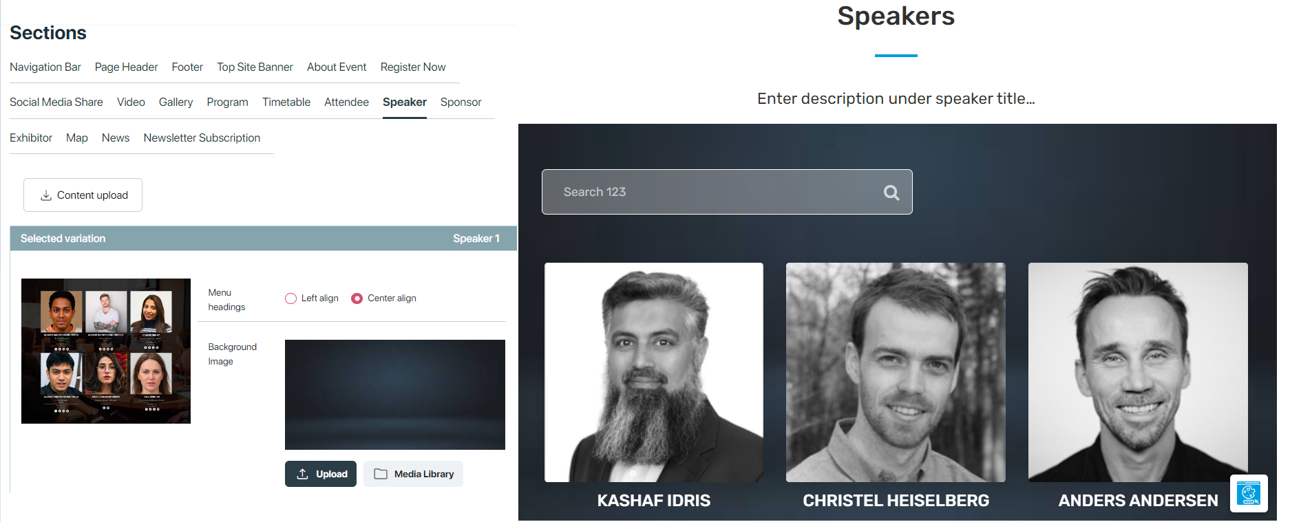
- Allows users to upload a background image, offering visual customization options to create an engaging speaker section.
- Provides flexibility to align menu headings either to the left or center, enabling users to adjust the layout based on their preferences.
Sponsor/Exhibitor
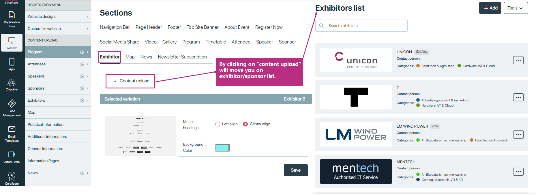
Sponsor/Exhibitor section Showcases all sponsors/exhibitors participating in the event, highlighting their contributions and offerings. In this section user have multiple variations, to display them as he want to display, he can show in single row and apply slider, can show in multiple rows have different options,user can explore by applying one by one. But one thing which is common in all variations, user can set menu heading alignment it might be left or center align, and also same for background colour by default it will be white but user can change it.
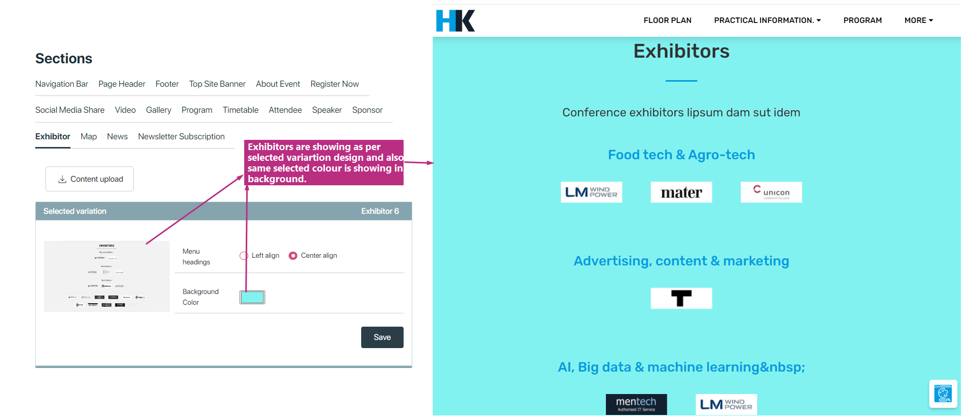
Additionally in sponsor/exhibitor sections have a button of content upload, and by clicking on this button it will redirect to user on sponsor/exhibitor listing. see attached screenshot:
Map
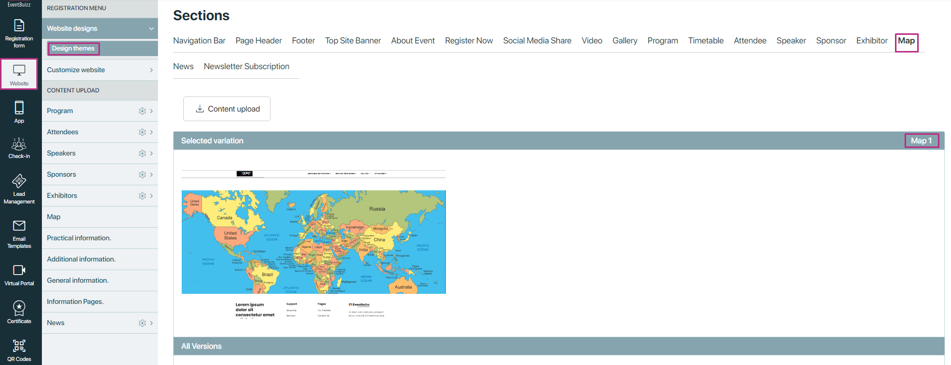
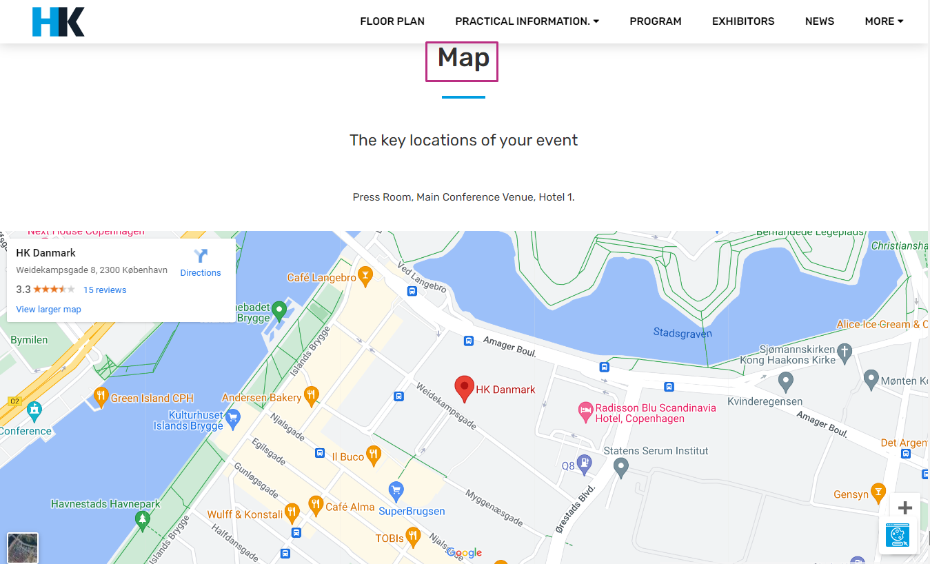
The Map section of the event site provides users with a visual representation of the event’s location. This section is crucial for attendees to easily find and navigate to the venue. The Map section typically consists of a Google Map embedded directly on the webpage.
While the current implementation of the Map section in the event center provides a single variation for displaying the map on the event site, there is potential for expansion and diversification in the future. As the needs and preferences of event organizers evolve, it may become necessary to offer multiple variations or customization options for displaying maps on event sites
And in event side it will shows like that:
Content Upload Button in Map Section
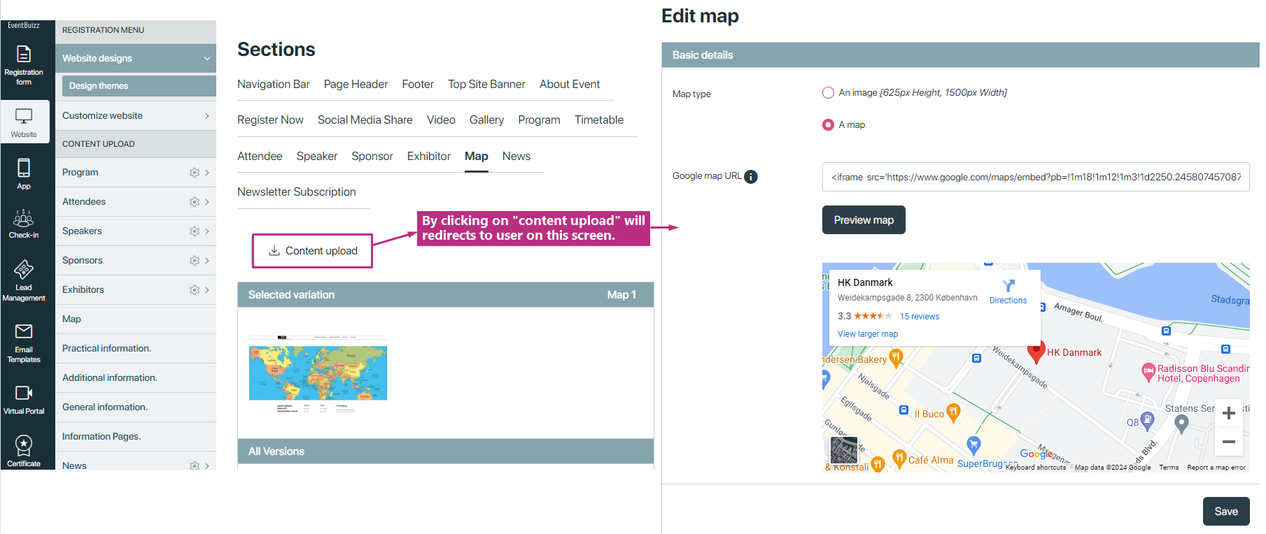
The Map section of the event center includes a convenient “Content Upload” button, offering user direct access to manage map locations from within the event site interface. This feature provides users with the ability to upload, update, or remove map locations, enhancing the customization and accuracy of venue information.
News
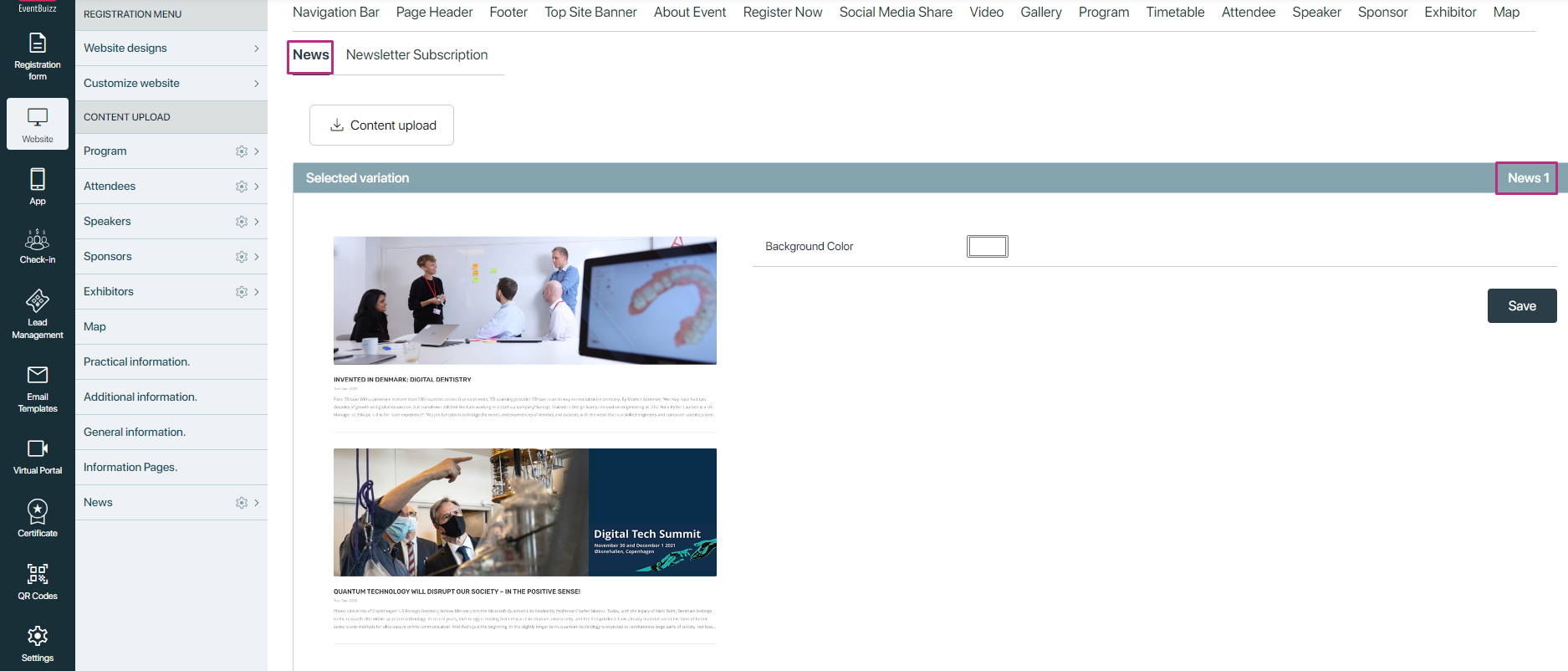
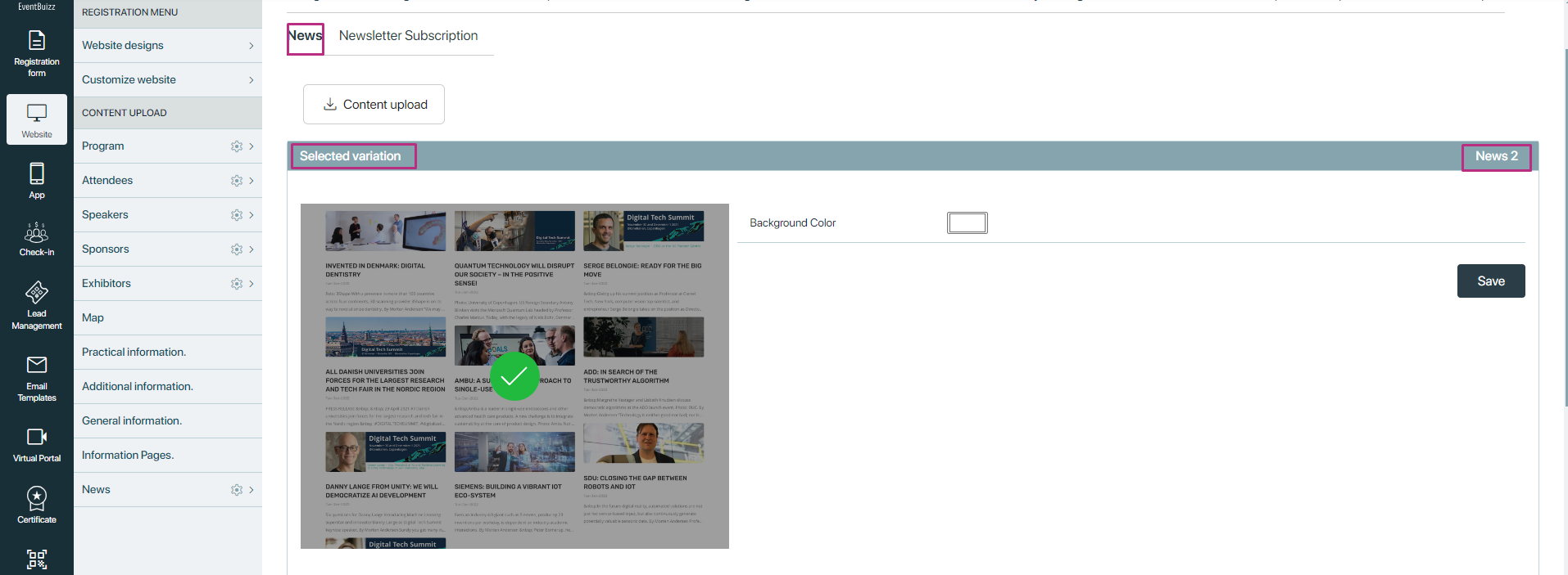
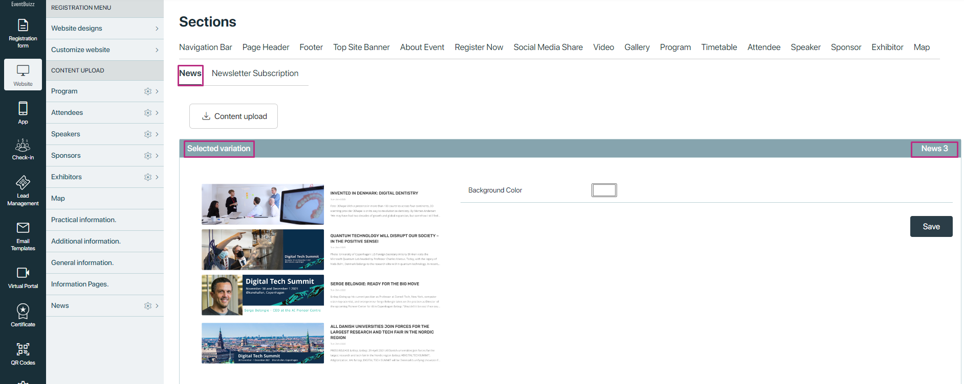
The News section offers users three distinct variations for displaying news content. Depending on the selected variation, news articles will be showcased in the Event Center according to the specified layout and design preferences.
Variation 1:
- Layout: This variation features a prominent layout with one large image displayed on the first row. Below the image, the title of the news article is showcased, followed by a description of the news on the third row.
Variation 2:
- Layout: In this variation, multiple news sections are presented in a single row. Each news section includes an image, followed by its corresponding title and description. This layout provides users with a compact and efficient way to view multiple news articles simultaneously.
Variation 3:
- Layout: News 3 organizes news content into a single column format. Each news article is represented by an image, with its title and description displayed adjacent to the image. This layout emphasizes simplicity and readability for users.
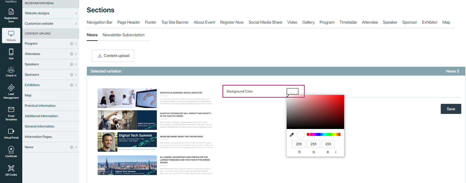
Common Feature
Background Color Customization: Regardless of the selected variation, users have the option to customize the background color of the News section to suit their preferences. By default, the background color is set to white, but users can easily adjust it to align with the overall design theme of their event site.
Newsletter Subscription
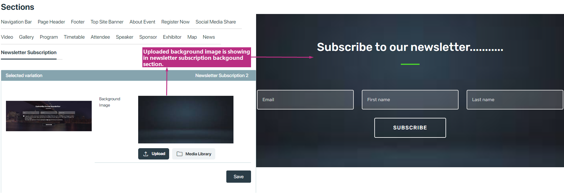
This section allowing users to subscribe to event newsletters or updates, ensuring they stay informed about upcoming events and important announcements. This section offers users two types of variations for capturing subscriber information and enhancing visual appeal.
These are the following two types of variations user have
- With Background Image Visualization
- Without Background Image Visualization
With Background Image Visualization
This variation incorporates a visually engaging background image behind the newsletter subscription form or link. The background image serves to attract attention and create a visually compelling experience for users.
Without Background Image Visualization
In this typo of variations, the Newsletter Subscription section does not feature a background image. Instead, users have the option to customize the background color according to their preferences.

Countdown
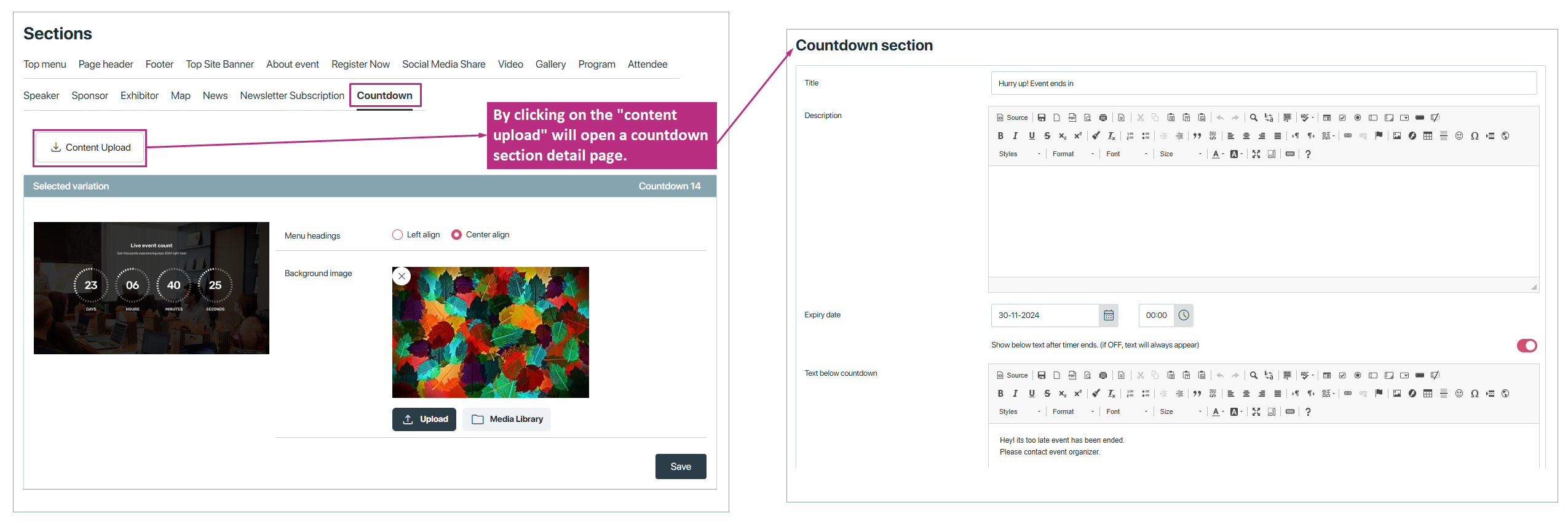
In Eventbuizz, countdown variations refer to the different ways you can display a countdown timer leading up to an event. This feature allows organizers to customize how the countdown appears on the eventsite , providing flexibility in how the event is promoted and creating a sense of urgency for attendees.
Countdowns can be styled differently based on the event theme, and you can choose where and how prominently the countdown is displayed. This customization helps align the visual appeal of the countdown with the overall branding of the event, ensuring a consistent and engaging user experience.
These are the following two types of variations user have
- With Background Image Visualization
- Without Background Image Visualization
With Background Image Visualization
This variation includes a captivating background image behind the countdown section, designed to draw attention and enhance the visual appeal for users.

Without Background Image Visualization
In this variation, the countdown section does not include a background image; instead, users can personalize the background with a color of their choice. This approach allows for flexibility in design, as users can select a background color that complements the theme of their event or aligns with brand colors.

The countdown section also includes a “Content upload” button, which provides users with a straightforward way to access the countdown detail form. This feature simplifies the process of managing countdown content, allowing users to quickly navigate to the form where they can input relevant information, such as event details or timing adjustments. The addition of this button makes it easy to customize and keep the countdown section up-to-date, improving overall user experience and ensuring that event information is both accessible and accurate.
Events Schedule
The event schedule is a feature that helps attendees to see upcoming and active events easily. It provides a clear timeline and events happening during an event. Attendees can check dates, times, locations, and other details of each event.
This feature ensures that users stay updated with ongoing and future events. It also allows them to plan their participation accordingly. Organizers can update schedules in real time, so attendees always see the latest information.
How to activate event schedule on eventsite
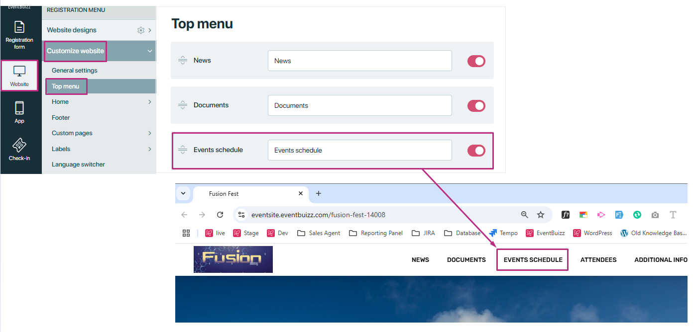
First, go to the Event Center and select an event. Then, go to Website → Customize Website and click on Top Menu.
You will find the Event Schedule setting. Turning it ON will make it visible in the top menu of the event site.
We have variations for the event schedule. To select a variation, go to website → website designs → design theme and click on event schedule. The event schedule variations will be displayed.
Event schedule variation
In this variation, users can personalize the background with a color of their choice. This approach allows for flexibility in design, as users can select a background color that complements the theme of their event or aligns with brand colors.

Tags role in event schedule
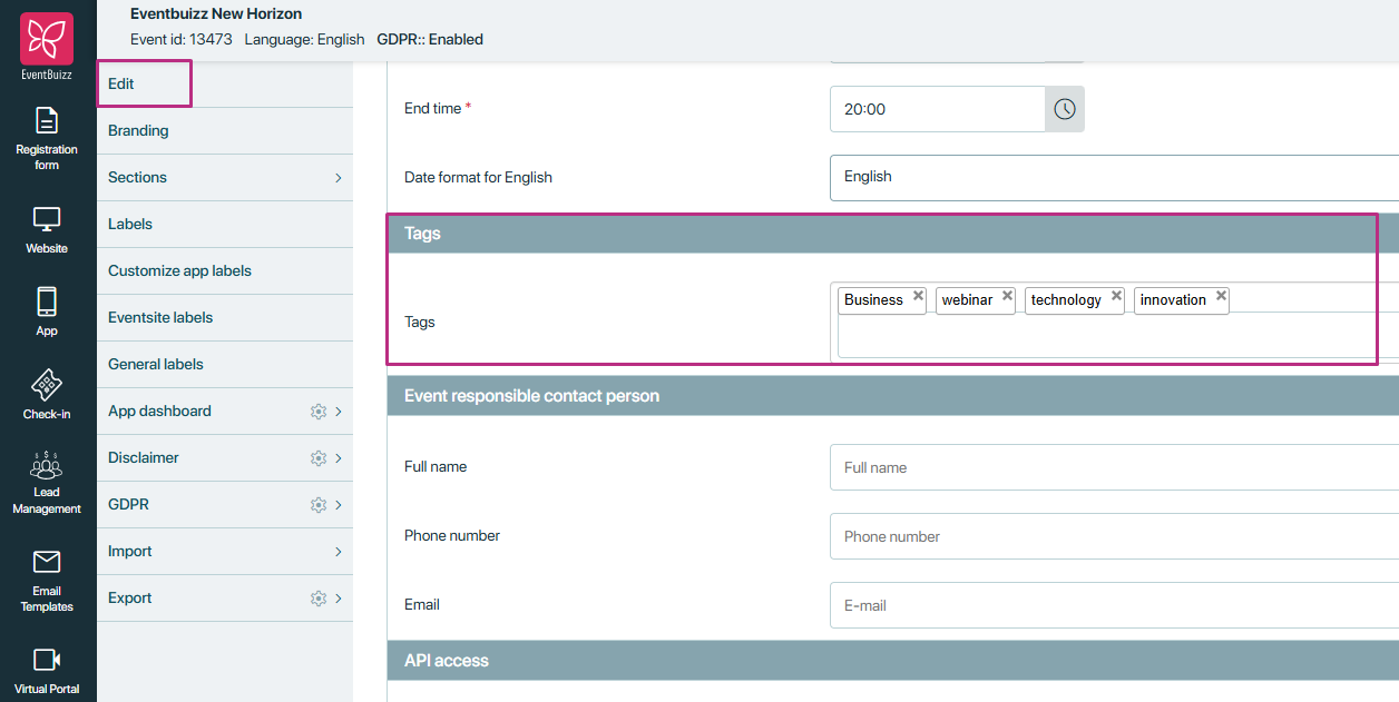
Tags in events are keywords or labels that help categorize and organize events. You can add tags while creating or editing an event. These tags make it easier for attendees to find relevant events based on topics, themes, or interests.
For example, while creating/ editing an event, you can add tags like “Technology,” “Conference,” “Networking,” “Workshop,” or “Education”, etc. These tags help in filtering and searching for events within the platform.
How event schedule work on eventsite
The tags added while creating or editing an event will be shown on the event site.
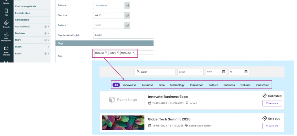
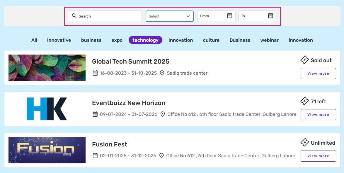
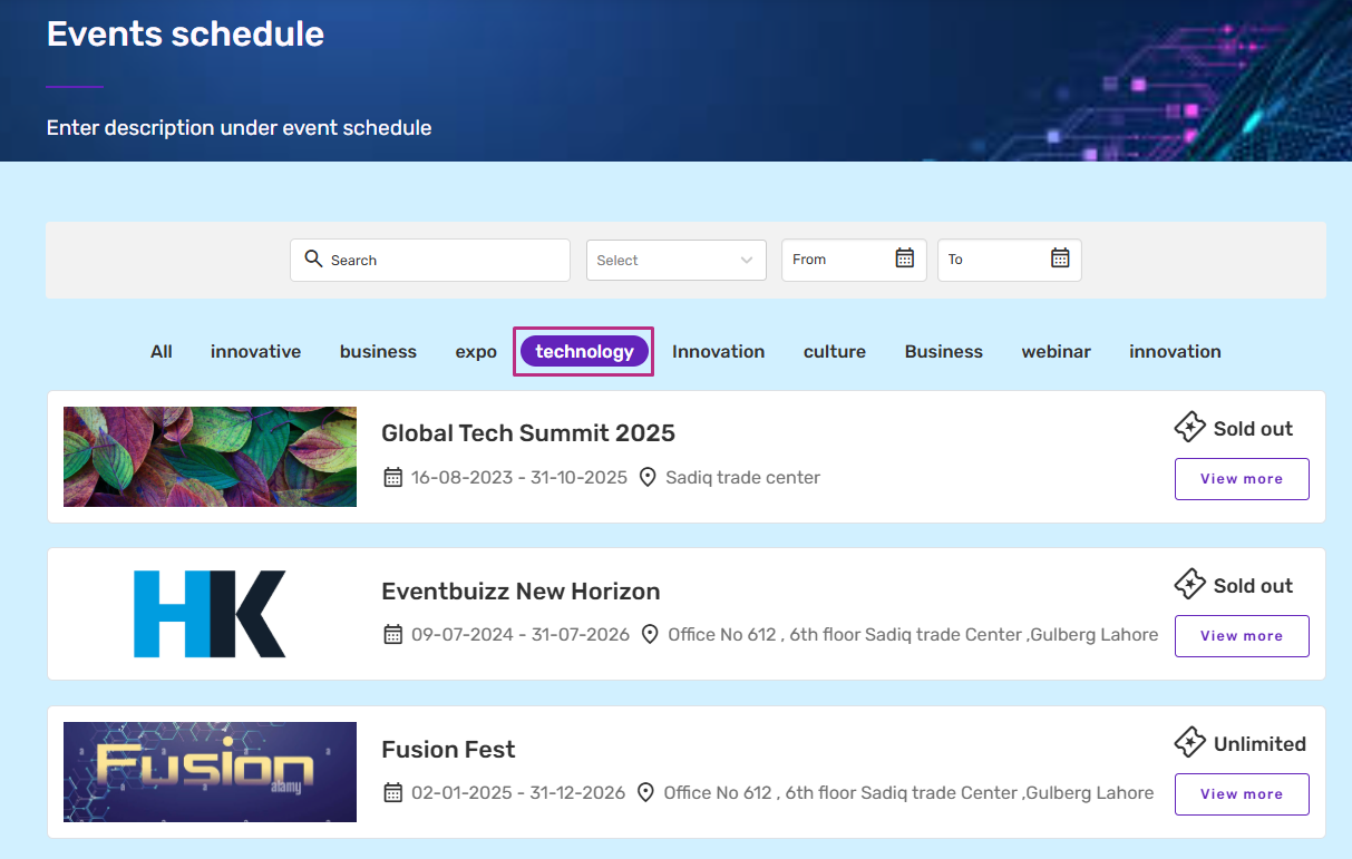
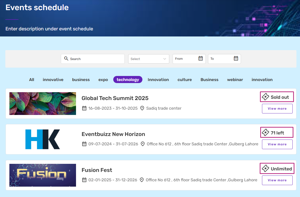
When a user picks a tag, all events with that tag will appear. For example, I selected the “Technology” tag, and now all events linked to “Technology” are shown below. This helps users find events related to their interests quickly and easily without searching through all events.
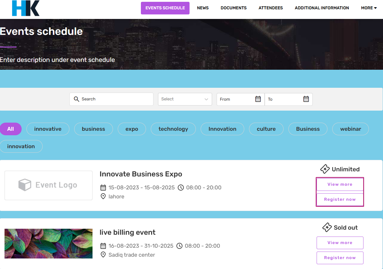
In addition, you can visit any “event site” and “registration site” by clicking on the “View More” and “Register now”. View more button will take you to the event’s web page, where you can see all the details. It helps users explore different events easily without searching manually. Just click and access the event site quickly. Register now button will take you to the registration site of that event, where user can register against that event.
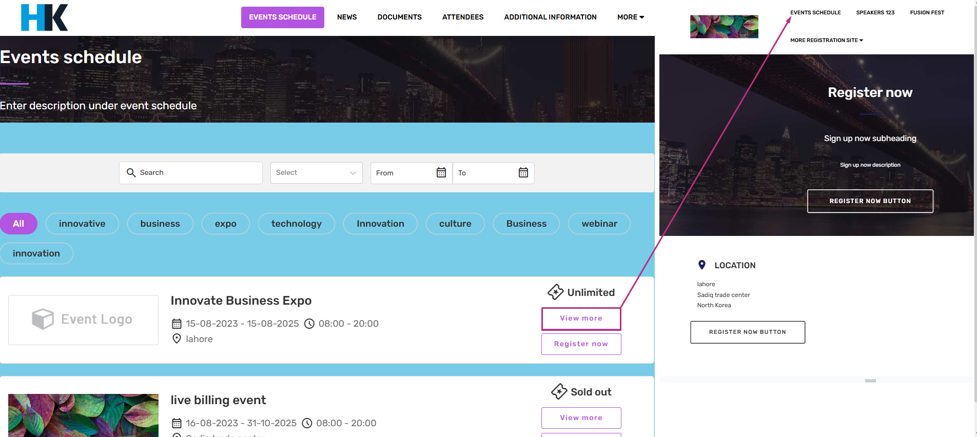
View more button will take you to the event’s web page, where you can see all the details. It helps users explore different events easily without searching manually. Just click and access the event site quickly
Register now button will redirect you to the registration site of that event.
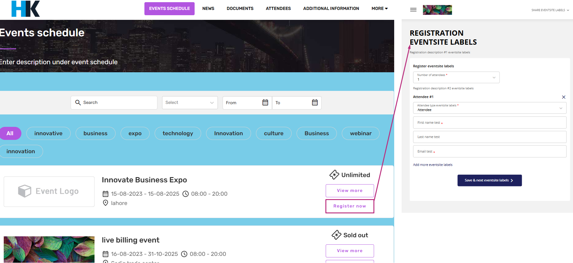
In the Eventcenter, each event can have two optional buttons displayed on the Event Schedule Listing page:
-
View More button – links to the event site
-
Register Now button – links to the registration site
The visibility of these buttons is controlled individually per event using configuration flags. This gives event organizers full flexibility to choose which buttons to display for each specific event.
How it works
For every event, there are two settings:
Follow this path for each event, to access the settings of the view more and register now button.
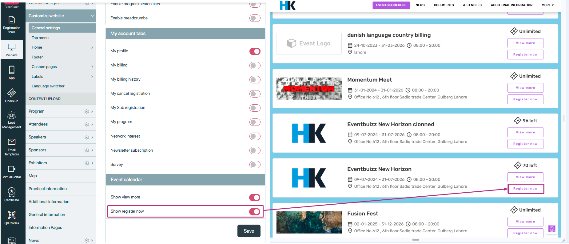
Website->Customise website->General settings-> Event calendar settings
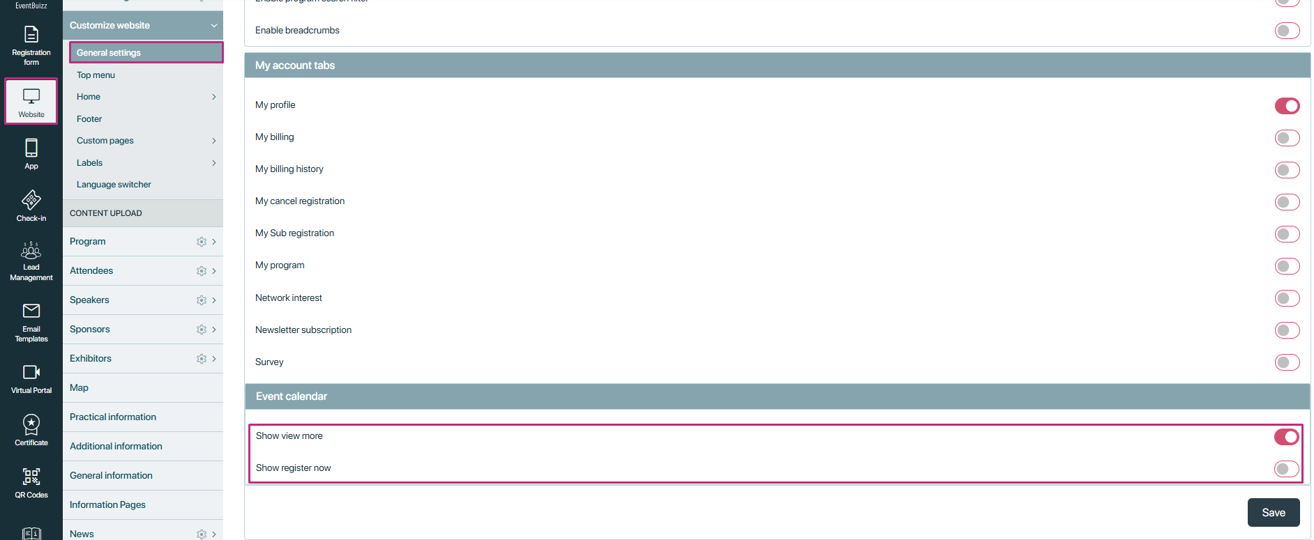
View More setting enabled:
- If view more settings is enabled, then this button will show on the listing.
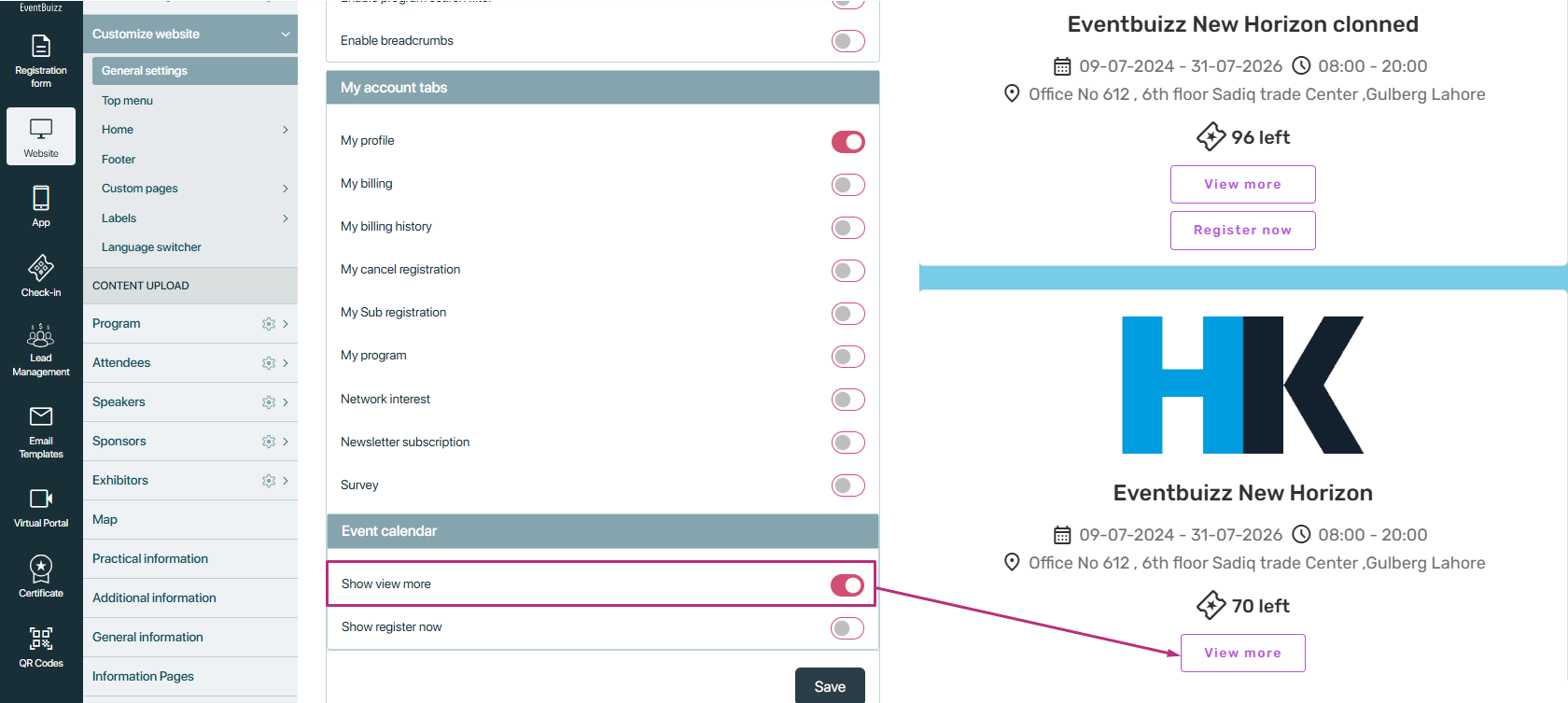
View More setting disabled:
If setting is disabled, then this view more button will not show on settings.
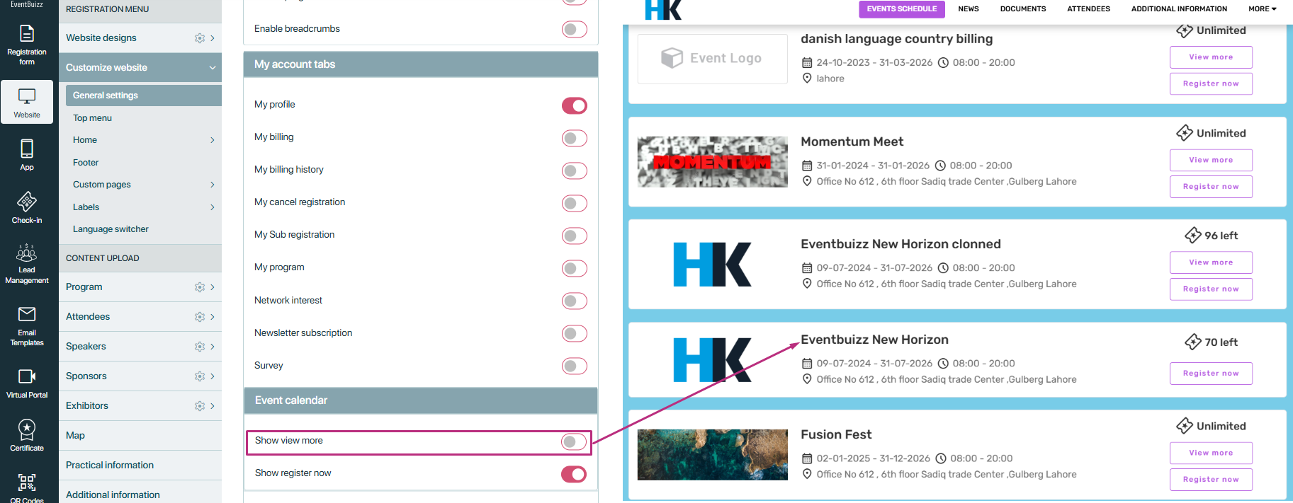
View Register now button enabled:
- If “Register now” button is enabled then register now button will show on listing.
How tickets are shown on the event site
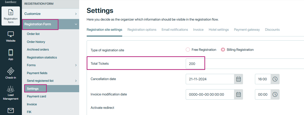
On the event site, each event has a total number of tickets. You can give events tickets in registration form -> settings.
These tickets represent how many how many people have already been given tickets for the event.
- Sold Tickets: If the number of assigned attendees reaches the total ticket limit, the event will be marked as “Sold Out.”
- Remaining Tickets: If some tickets are still available, the event site will show the remaining number of tickets.
- Unlimited Tickets: If the ticket limit is set to 0, the event site will display “Unlimited” instead of a number.
Filters
The filters likely used for searching and filtering data help refine search results efficiently. Here’s what each filter does:
- Search box – Allows users to type keywords and search for specific records.
- Dropdown menu: This filter allows users to filter events based on their status. The available options are:
- All events – Displays all events, regardless of their status.
- Active events – Shows only events that are currently ongoing or active.
- Upcoming events – Lists events that are scheduled to happen in the future.
- Date Range Filters (“From” & “To”) –
